Social Networking for Dog Owners
The Problem
Social and personal connection of all kinds has been a driver of society since, well, forever. Once such connection is the bond humans develop with their pets. For dog owners in particular, it is not only important to develop their own connection with their dog, but also facilitate connections with other dogs. Dogs are social creatures too, after all.
There are many social networking platforms and apps that we use to meet new people. However, there are few options specifically designed for dog owners who want to meet other dog owners in their area. Of course, dog parks are one solution. But what about options for those who prefer to introduce their dogs in a calmer environment? Or for shy dogs who don't love crowds, but still enjoy spending time with other dogs in a more controlled way? What about dogs who are working on behavioral issues which makes socialization a necessity, but aren't quite ready for a large number of dogs all at once? Additionally, the Covid-19 pandemic introduced other concerns related to social distancing, vaccination status, and so on. These are just some reasons why the dog park isn't always the best solution for lots of dog owners.
After speaking with friends, family, and coworkers who own dogs, it became apparent to me that people may want something that could enable this form of connection. I set out to see if this is indeed correct, and what a solution might look like.
My Hypotheses
1. Dog owners want to meet other owners to gain socialization opportunities for their dog, but the majority are not sure how to go about it.
2. Dog owners want to understand similar characteristics before setting up a meeting with a new dog, including temperament, size, age, energy level, etc.
My Role
- Research: Quantitative research, Competitor analysis, User personas and journey mapping
- UX Design: User flows, Wireframing, Prototyping
- Visual & UI Design: Mood board, Style guide and UI Kit development
- Usability Testing
Process
Step 1: Empathize with the user
Primary Research: Dog Owner Survey
70 dog owners participated in my survey, answering questions focused on:
- Their interest in meeting other dog owners to socialize their dogs
- If/how they meet other dog owners to socialize their dogs, and if they are satisfied with the current options
- What they consider before introducing their dog to a new dog
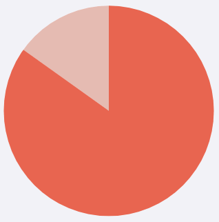
87%
of people think it’s important to give their dog(s) opportunities to socialize.

47%
don’t think there are sufficient options for socialization.
59%
of people are interested in connecting with other dog owners in their city or local area, but haven’t done so yet.
“I’m too shy to make conversation and my dog is an American bully. They have the stigma of being “aggressive” when she is the sweetest thing in the world.”
“We take our dog to the dog park occasionally but it would be nice to go when other dogs with her temperament and play style are there. I am too shy to make conversations with other owners.”
“Our dog has specific needs and requires certain types of dogs and people to mingle with. Can be hard.”
“Not sure where to connect with other dog people”

42%
have organized a play date for their dog to meet a new dog. However, there were some common drawbacks.
“There have been times that it hasn’t worked out so well. Taking into consideration all the dogs temperaments, activity level and reactivity if any should always be considered.”
“The other dog has aggressive tendencies and our dog gets overexcited, so both were too overwhelmed.”
“My dog ended up not getting along with the other dog so it would be good to have some advice on how to find a good playmate for my dog.”
“It was easy to organize with people we know, but their dogs don’t necessarily play at the same level as our dog. It would be nice to have play dates with dogs with similar temperaments and play styles.”
58%
have not organized a play date for their dog to meet a new dog. There were some common reasons.
“Not sure how to find other dog people”
“Don’t know where to meet new dogs but would love to”
“Don’t know [how to find] good matches for play”
“Logistics and knowing people in a new city. I’m not one to walk up to random people and try to make a dog play date”
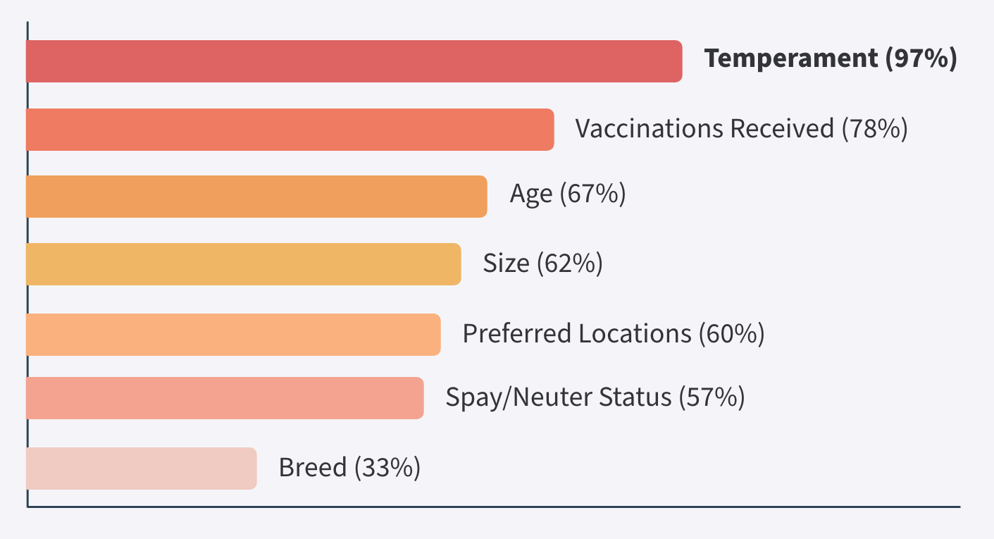
Before introducing their dog to a new dog, people consider:
Secondary Research: Competitors
To improve my understanding of the current dog socialization options, I researched some competing offerings.
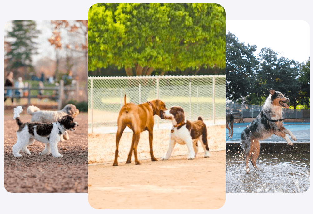
Dog Parks
PROs
- Lots of space to run around
- Dogs can exercise off leash
- Dogs can get socialization and mental stimulation
CONs
- Could encounter dogs who are aggressive, untrained, unsocialized, reactive, or unpredictable
- Don't know the vaccination status of dogs
Above PROs and CONs are from survey responses.
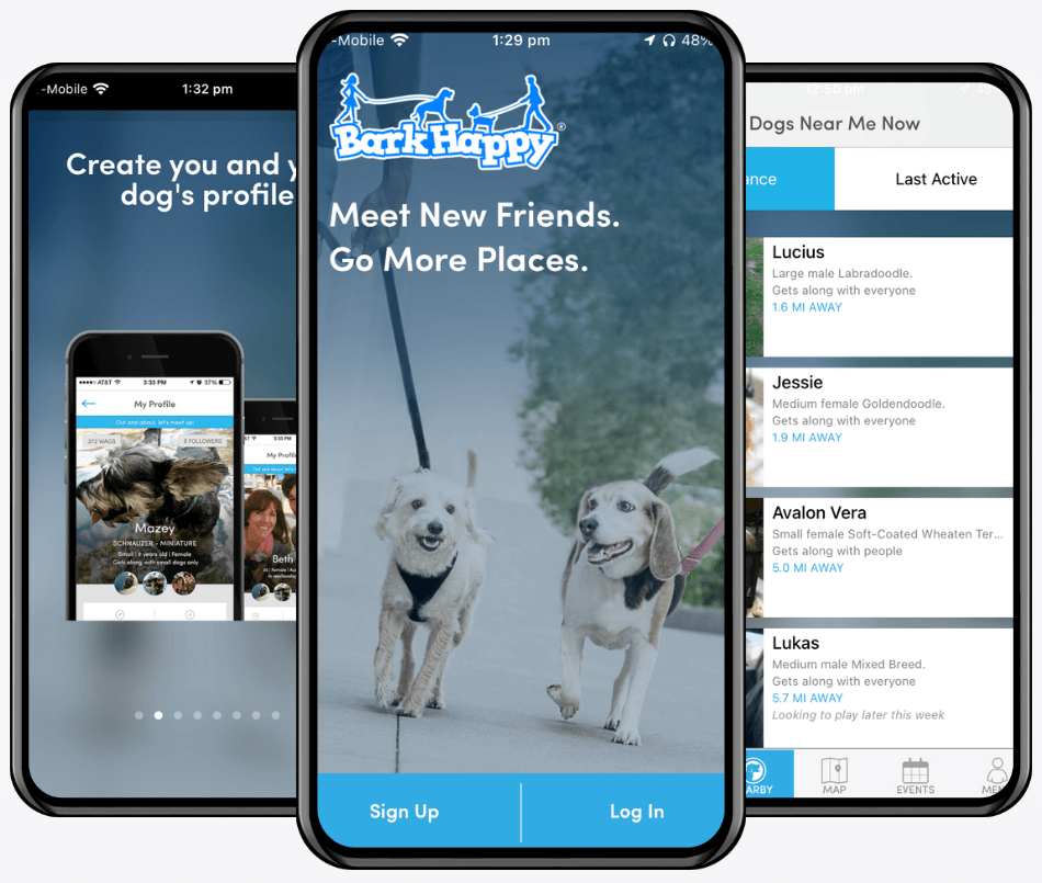
BarkHappy App
PROs
- Option to schedule a group event or one on one meeting
- Chat feature to talk to owner ahead of meeting
- Report or block user button (safety feature)
CONs
- No verification step during account creation. But features are locked until a user creates a profile
- No way to filter dogs by characteristics
Booper App

PROs
- Verification required to use features (safety feature)
- Option to schedule a group event or one on one meeting
CONs
- Limited dog characteristic filter options
- No way to add a custom location to an event (limited to parks listed on the app)
- No chat feature in order to talk to a new dog owner ahead of the meeting/event
Personas
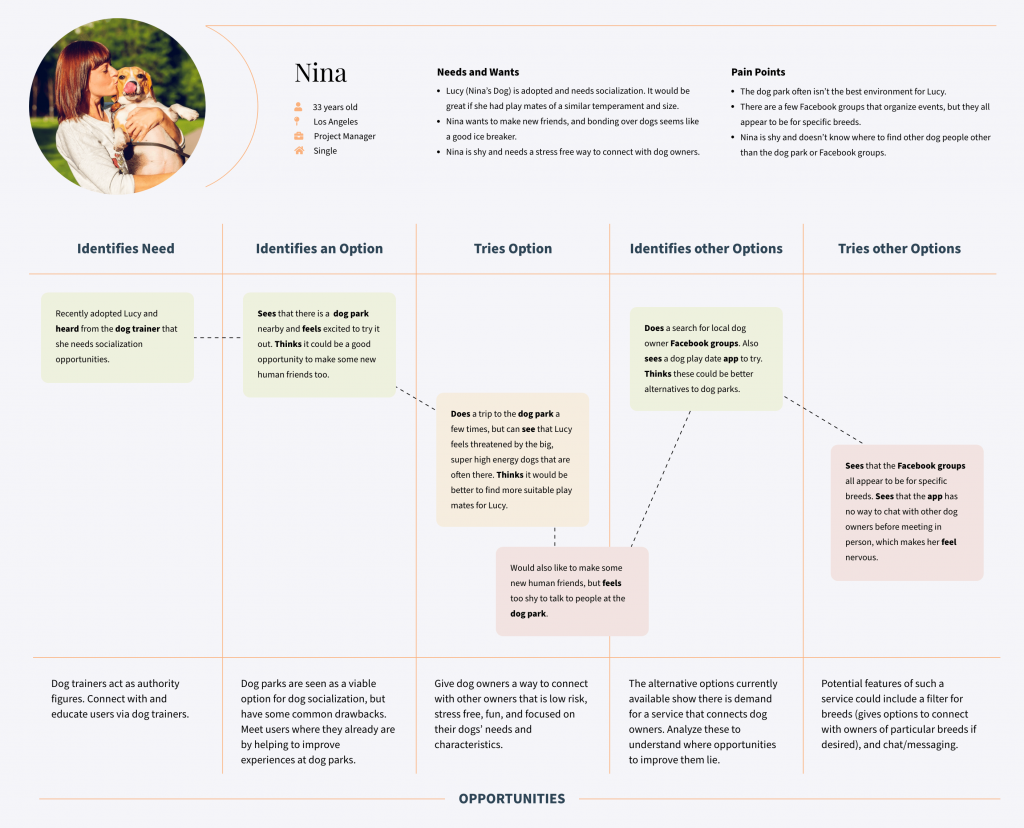
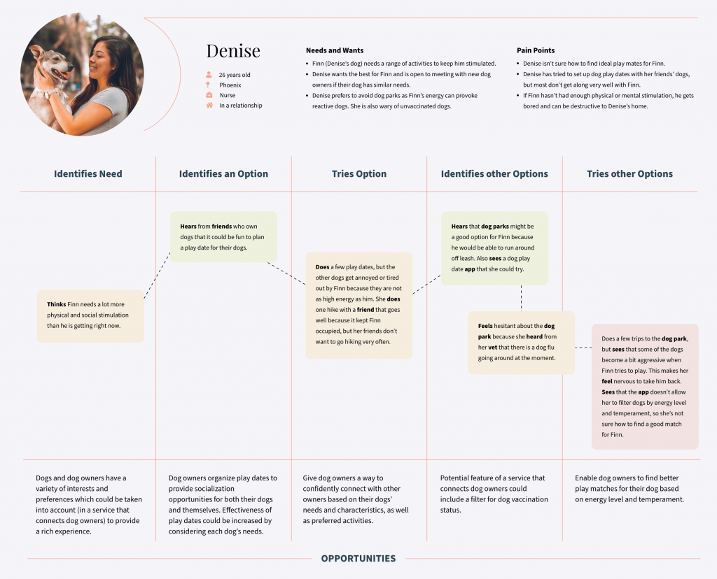
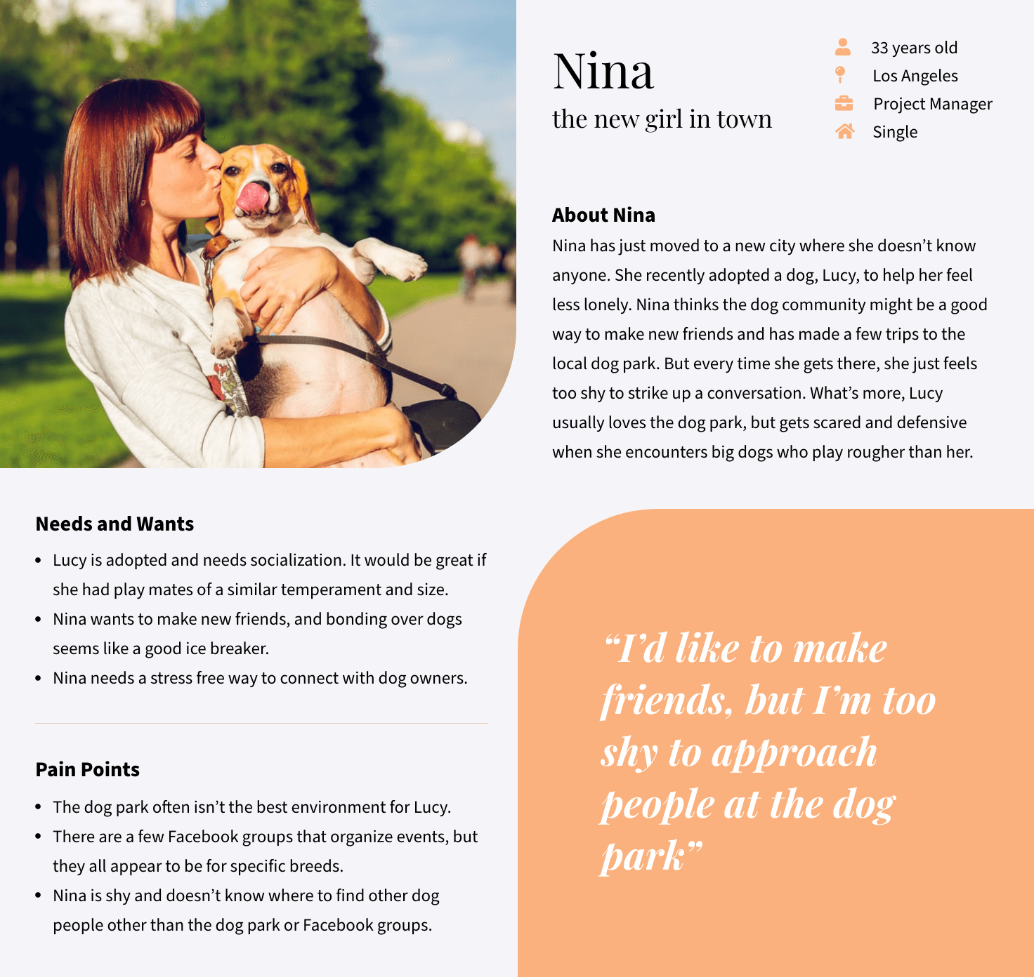
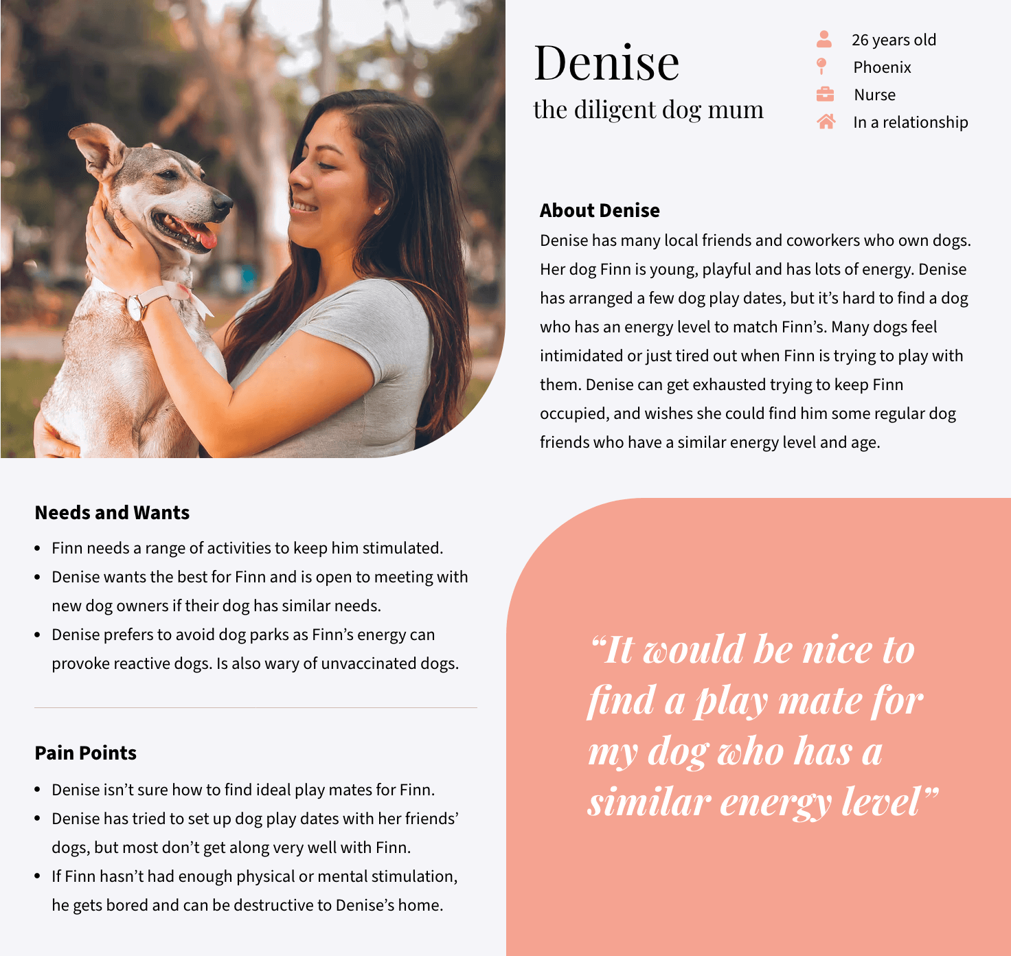
Based on the survey results, I created two personas that captured the most common themes. With the personas I honed in on potential user goals, needs, and frustrations, to begin imagining how my app might solve their problems.
Existing Journey Mapping
Drawing from my primary and secondary research, as well as the exploration I'd done with the user personas, I mapped the 'as is' journey for each persona. During this exercise I imagined what might influence users in each stage of their journey - what they might hear, see, think, feel and do to shape the outcome of each stage. Through this I was able to see some of the potential opportunities to solve their problems.
Defining User Needs
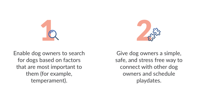
After bringing together the commonalities across my research, as well as my exploration with Personas and Journey Maps, I defined clear user needs.
Step 2: Ideate
User Flows
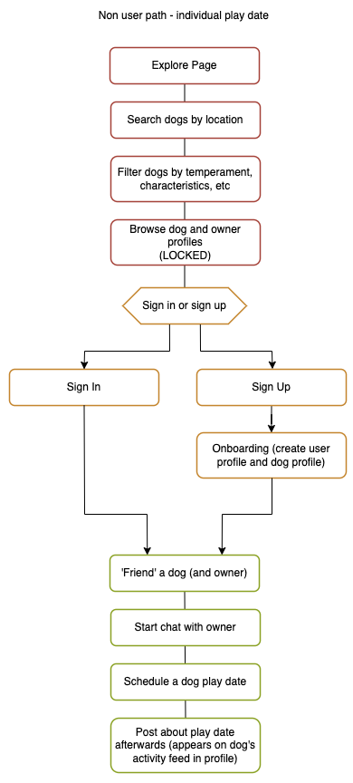
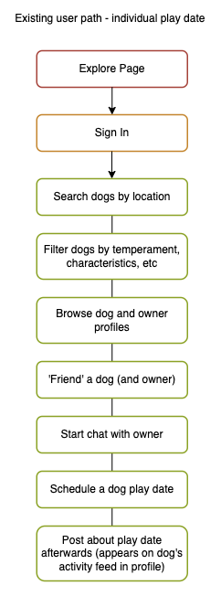
To gather all my thoughts and ideas, I put together user flows to solidify core features, as well as capture the main user goals and how they would be achieved.

Step 3: Visual Design
Mood Board
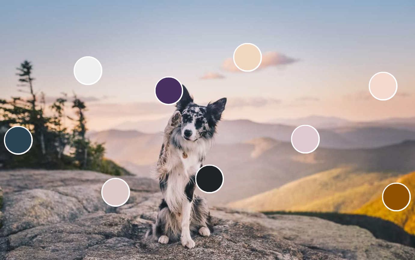
I wanted the color palette to feel organic, comforting, and calming, but also inspiring and energizing. Sunsets typically evoke these types of emotions, and colours in nature tend to work harmoniously together, so I used this image of a sunset for inspiration. Additionally, dogs are inherently connected to the natural world so I thought this sunset in a forested area was a fitting theme.
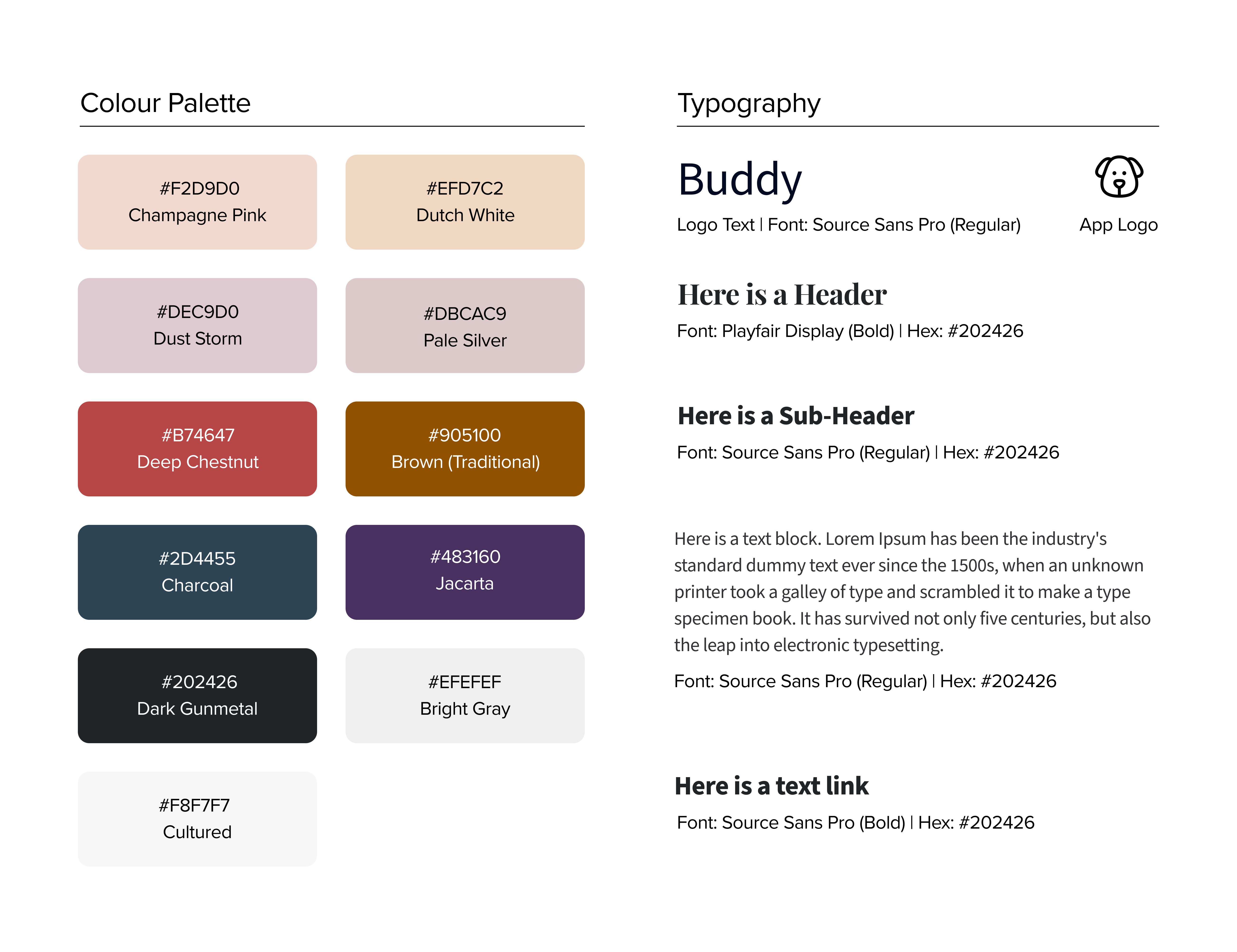
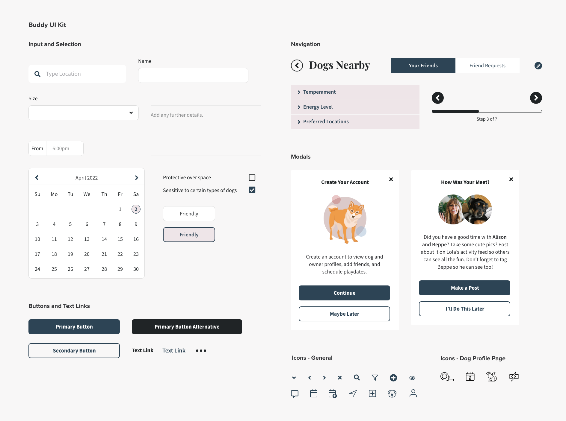
Style Guide and UI Kit
These served as a reference point to help ensure everything remained visually consistent across the app, from colours, to typography, to all UI components.
Step 4: Test
I asked three dog owners of varying ages to test my initial prototypes. Rather than setting a list of specific tasks, I directed testers to key flows within the app and simply asked them to click around as they would normally while verbalizing their thought process.
I encouraged testers to point out any areas of confusion or friction in order to understand where I could make improvements.
The key flows I received feedback on:
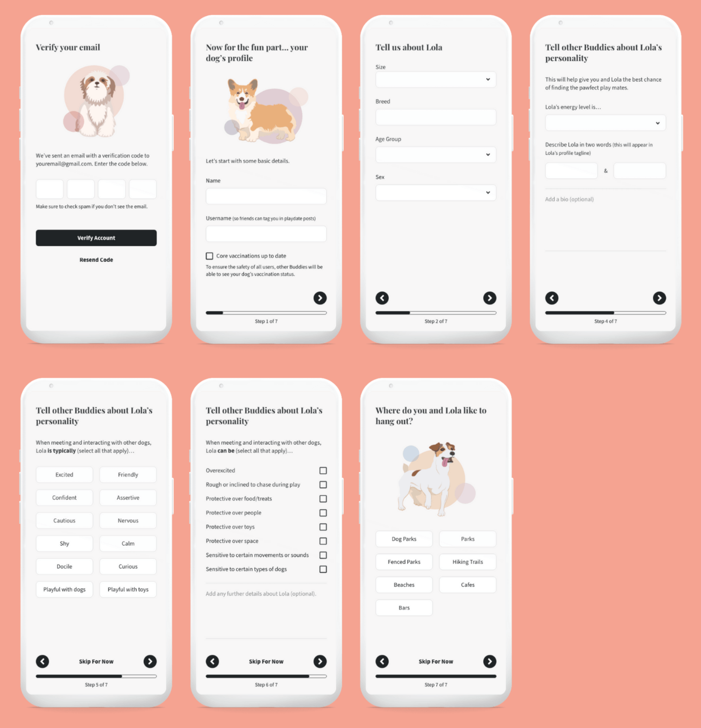
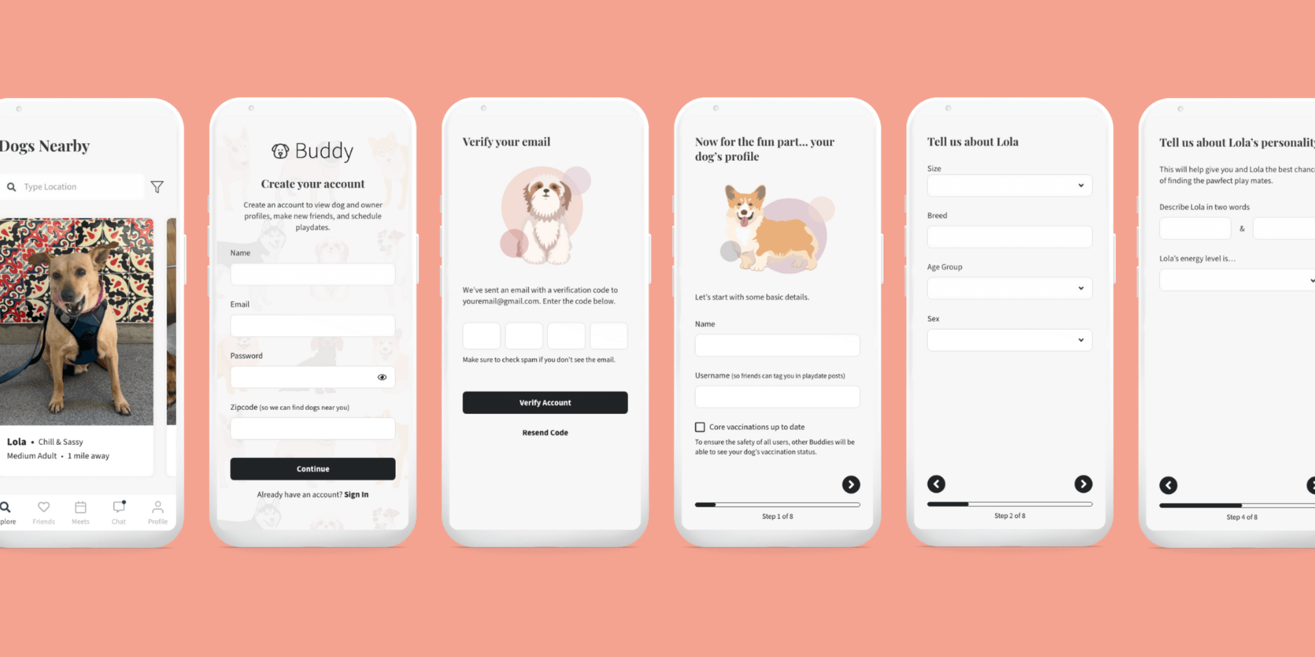
- Onboarding (account and profile creation)
- Viewing a dog/owner profile and taking an action (e.g. start a chat or schedule a meeting with the owner)
- Scheduling a meet up with a dog owner
Onboarding

Issue 1: Testers wanted to add multiple photos to their dog's profile
Testers wanted to add multiple photos to their dog's profile, and also see multiple photos on any dog profiles they viewed later on in the app. Having multiple photos makes testers feel more confident that a dog's profile is real.
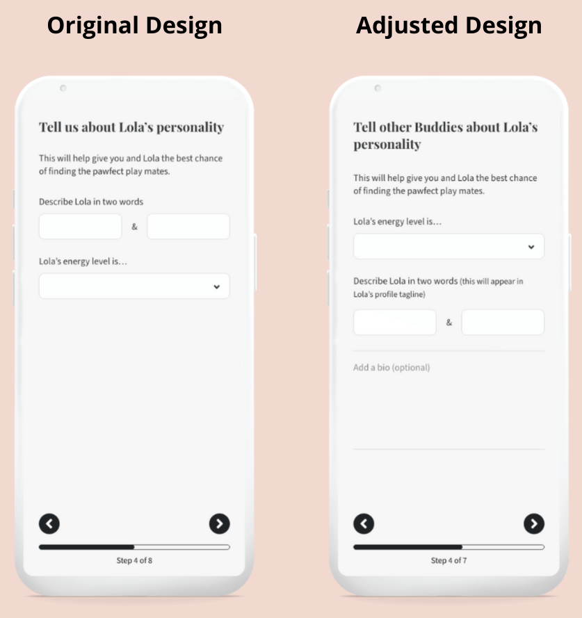
Issue 2: Describing their dog in two words was a common friction point
Testers liked this idea, but were initially unsure of which two words they should use to describe their dog. I noticed testers filling out energy level first, then returning to describe their dog in two words with more success. I switched the order of the questions and added text prompts to clarify both the audience that would be viewing this information, and where it will be displayed.
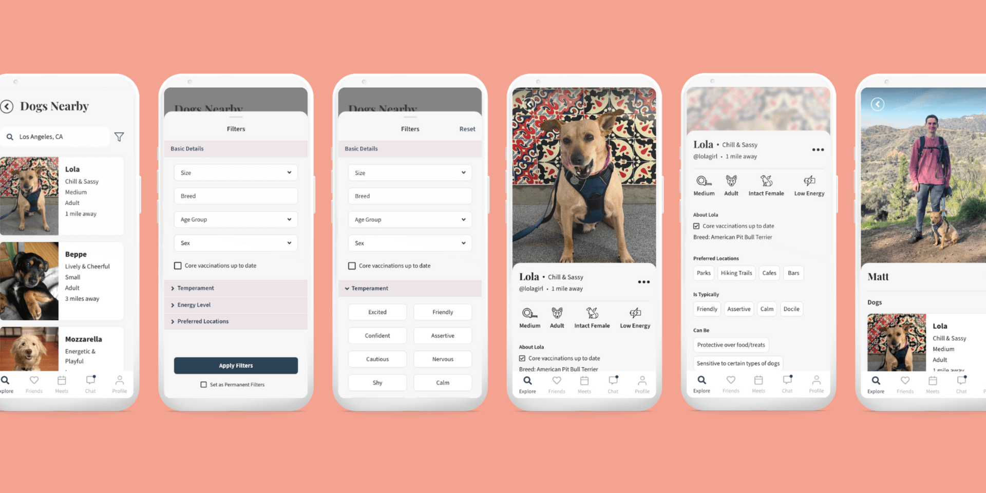
Dog & Owner Profile
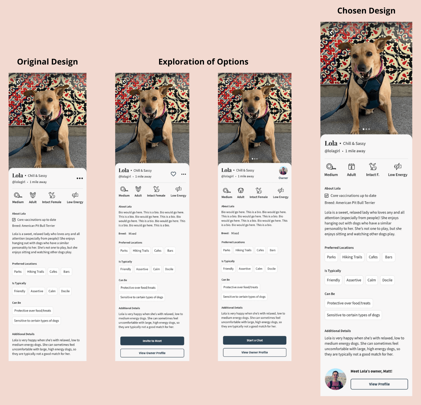
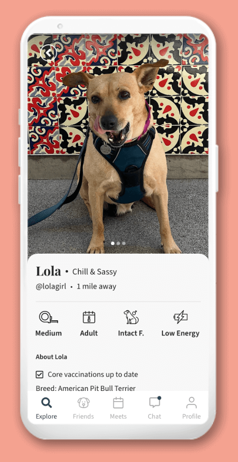
Issue 1: Dog profile page lacked a clear action button
Testers instinctively scrolled down on a dog's profile to view it, consistently missing the kebab menu icon at the top. Testers expected to see a larger action button somewhere on the profile page. I explored a few different button and placement options. The chosen design uses a button further down on the profile page with a clear CTA to meet the dog's owner. From the owner profile page, users can complete primary actions (e.g. start a chat or schedule a meet up). The kebab menu was removed to allow more space for longer dog names.
Issue 2: Testers misunderstood the heart icon's purpose
Testers thought the heart icon's purpose would be to save profiles to a private 'favorites' list, rather than to make a friend request. Common feedback was that the heart icon is typically associated with liking or favoriting something, and they wouldn't want to accidentally send a friend request based on this assumption. Testers also didn't expect the heart icon to be visible on their friends list, as unfriending typically isn't a primary action and they wouldn't want to be able unfriend someone so easily. Through this testing it became apparent that the heart icon was unnecessary, so I completely removed it from the app.
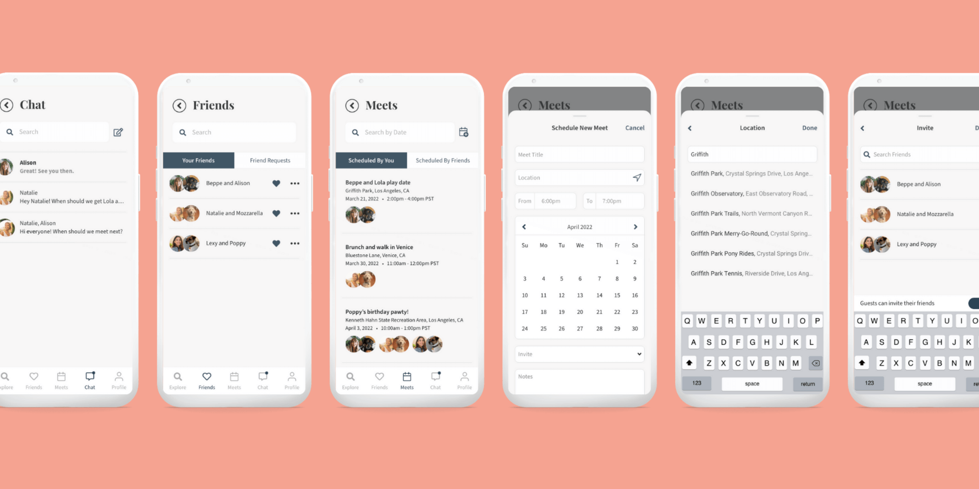
Scheduling a Meet Up

Issue 1: Meet ups could be easily missed
Due to the meets being split into two tabs, testers were concerned that they might miss a meet up if they forgot to check the tab that wasn't the default. The adjusted design shows all meets on one page, with the 'Edit' or 'Contact Host' buttons indicating if the event was scheduled by the user or a friend.
Step 5: Test Again
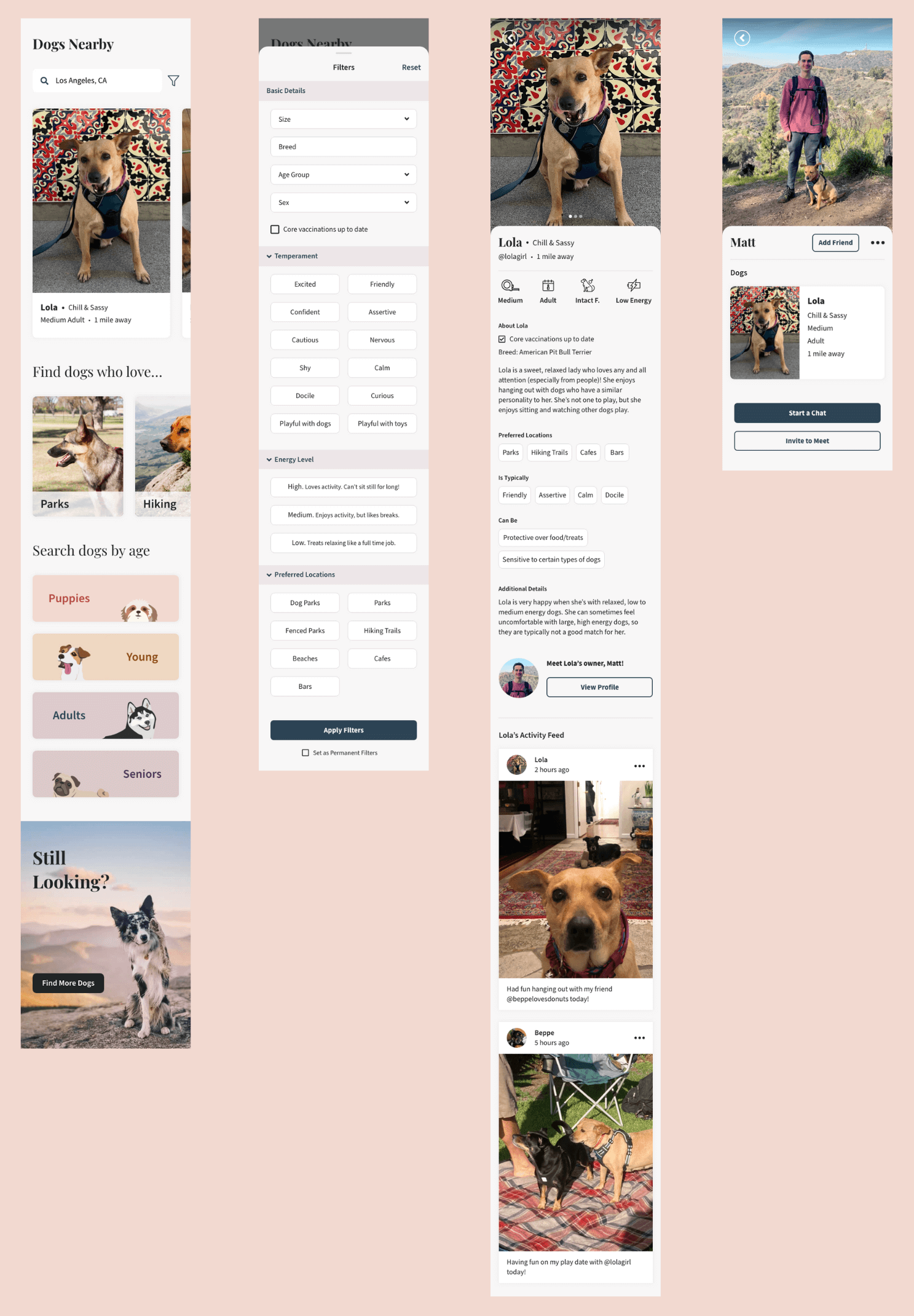
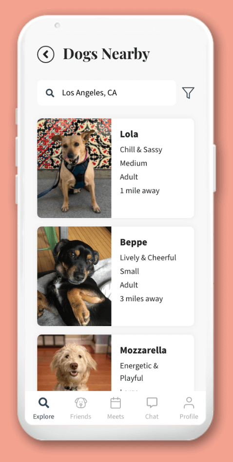
Once I'd made the above adjustments, I asked the same three dog owners to go through the same key flows again. All the adjustments were received positively and there was no further feedback from an MVP perspective. Testers agreed that the app provides a simple way to search for dogs based on the characteristics that are important for them and their own dog, as well as stress free ways to connect with dog owners. Below are wires and prototypes of the end result.
Search, filters, and viewing profiles
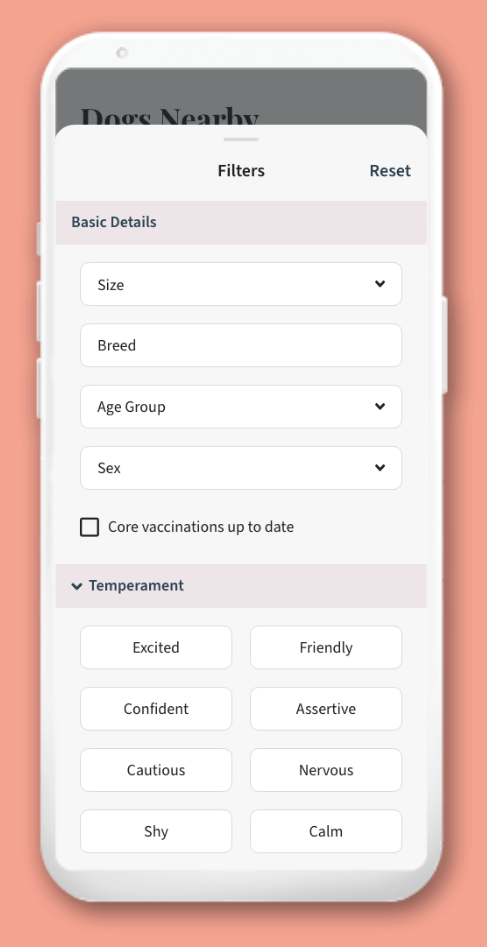
- The Explore page and the filters give users a way to search for dogs based on specific characteristics that match their own dog's needs.
- The dog profile page includes all the information that can be filtered for.
- The dog's activity feed gives a more complete impression of the dog's personality and what kinds of dogs it typically hangs out with.
- The owner profile page is where the user can take actions to connect.
Learnings
During Research:
- I could have asked more questions to gain a better understanding of the demographics of survey respondents, for example age group and family status. It is likely that an individual’s motivations with regards to their dog change during different periods of their life (e.g. people with no kids may have more time to give their dog socialization opportunities vs. people with kids). This would have helped me better cater to the needs and wants of the most prominent user groups.
- If I’d had more time I would have liked to go deeper with my research by conducting interviews to understand attitudes towards dog socialization options and current behaviors in the user journey.
During Testing:
- If I'd had more time to recruit and schedule more than three testers, I would have.
- A bigger testing group would have enabled me to better gauge outcomes (i.e. whether or not this app would meet user needs and wants in the real world).
General:
- One thing about the real world application of an app like this is to be realistic about the challenges of a social networking app - i.e. obtaining a critical mass of users. Marketing and a focus on user adoption would be crucial to this app's success in real life.
Illustration credits: pch.vector from www.freepik.com

