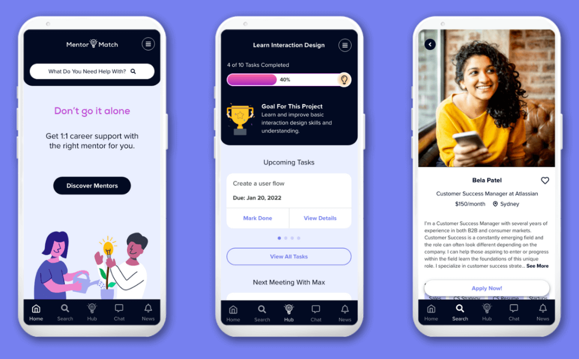
Enabling mentees and mentors to connect in a structured and personalized way.
The Problem
The inspiration for Mentor Match stemmed from a personal struggle. In mid 2021, I began taking the first serious steps toward changing my career path from Customer Success to UX/UI Design.
I knew I would need guidance while learning the necessary skills to successfully transition into this new field. I was clear about my personal requirements. I needed a structured way of learning with a framework that included set tasks, deliverables, and outcomes. Just as importantly, I wanted to collaborate with a mentor who would give me feedback and ensure the work I was producing was of a high standard.
After researching a lot of options on the market, I ended up going with an online course that suited my budget and time constraints.
Upon reflecting on the search process later, I was surprised that I wasn’t able to find many approachable, budget friendly options for mentorship that offered both the level of structure AND the interpersonal aspect I was looking for.
Other than intensive bootcamp style programs (which ranged from kind of expensive to plain old really expensive), everything I found seemed to offer just one or the other.
I found standalone courses that didn’t include personalized feedback. I found platforms that enabled you to schedule loosely defined sessions with mentors. But nothing I found offered both aspects to those that might not have the time or funds for a bootcamp.
I wanted to create a solution that:
1. Provides an offering for this gap in the market.
2. Helps solve common challenges faced by mentees and mentors.
3. Considers aspects of mentorship that are most important to mentees and mentors.
My Role
- User Research: Quantitative & qualitative research, Empathy maps, User personas, Customer journey mapping
- UX Design: User flows, Low-fidelity wireframing & prototyping, UX writing
- UI Design: Style guide and UI Kit development, High-fidelity wireframing & prototyping
- Usability Testing
Process
Step 1:
Step 2:
Step 3:
Step 4:
Step 5:
Step 1: Empathize with the user
Surveys and Interviews
I surveyed 10 mentors and 20 mentees via google forms. I interviewed 2 mentees and 2 mentors via zoom call. Questions for mentees focused on why they wanted a mentor, challenges they faced searching for a mentor that fit their needs, and what the most important considerations are when searching for a mentor. Questions for mentors focused on their reasons for becoming a mentor, challenges they face during mentorship, and what the most important considerations are when taking on a new mentee. My key findings are below.
Mentees
Motivations
Mentors
Mentors

Motivations
Common reasons for wanting a mentor:
Career coaching, Assistance with specific skill(s), Job search preparation, Feedback on work, Advice for a specific industry, Review of LinkedIn/resume/portfolio.

Motivations
- 100% want to gain professional skills
- 88% want to help people & gain personal fulfillment
- 50% want to earn an extra income

Challenges
- 59% of mentees strongly agree that finding the right mentor is challenging
- 82% are unsure how to ask someone to mentor them
- 65% are unsure where to search for a mentor

Challenges
- 75% struggle keeping mentees engaged and motivated
- 63% have trouble providing structure for the mentorship
From the interviews:
“Finding the right match in terms of personality and compatibility.”

Considerations
(When searching for a mentor)
88% agree on: the mentor’s specific skills & expertise, and their communication style.
From the interviews:
“Level of structure and support offered.”
“Mentor’s personality and overall compatibility with me.”

Considerations
(Before taking on a new mentee)
88% agree on: level of structure & guidance a mentee needs, their expectations, and their goals.
From the interviews:
“Asking screening questions to ensure alignment of expectations and overall fit.”
“Setting clear goals and specific tasks.”
Empathy Maps
To visualize the findings I gathered from the surveys and interviews, I created four empathy maps - two representing mentees and two representing mentors, who each have different overall goals. This helped me expand on the research and consider what a potential user's feelings, pain points, and motivations might be, as well as what might influence them.
Personas
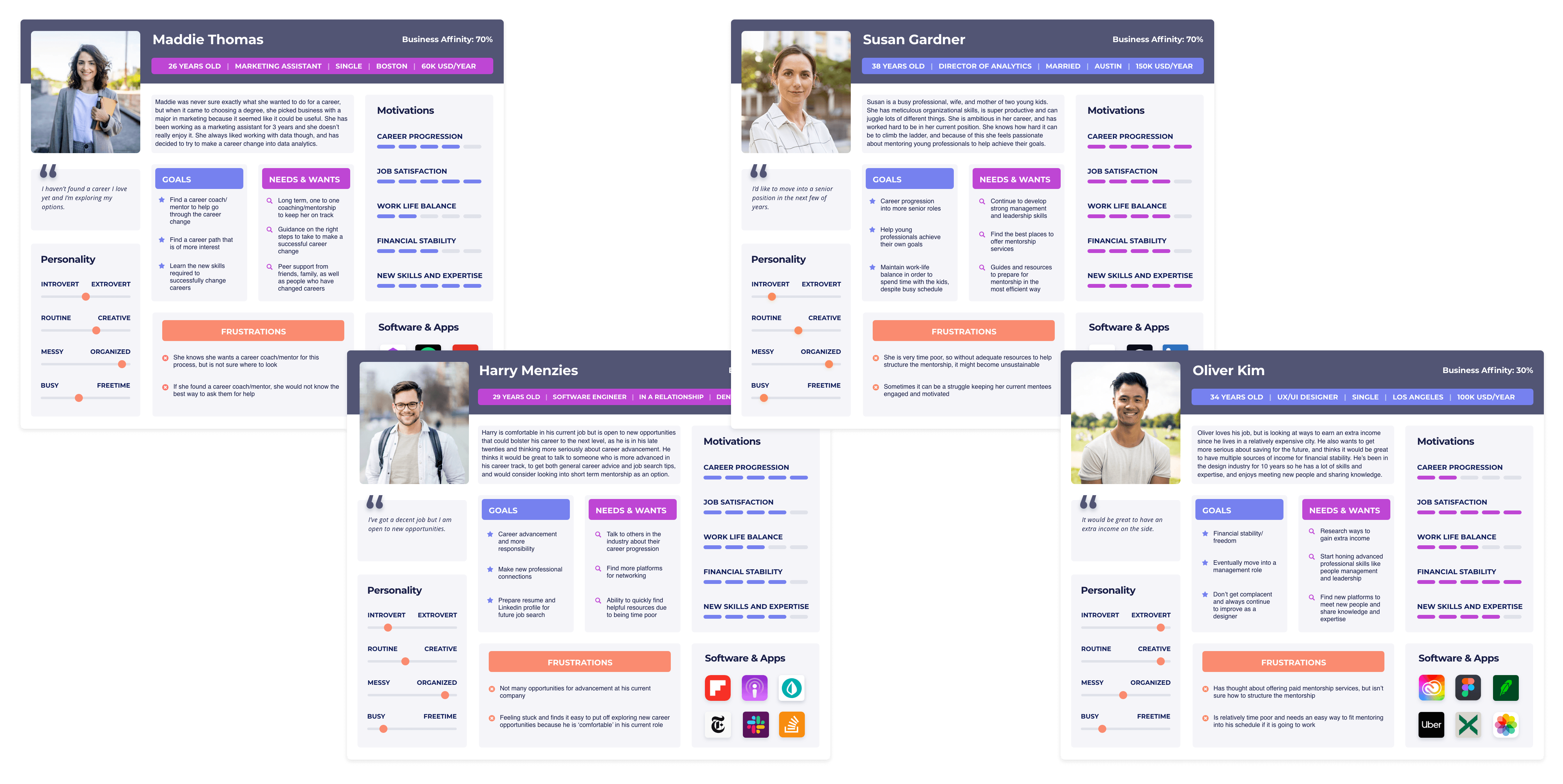
Building on the empathy maps, I took my four hypothetical users and created a persona for each of them. With the personas I honed in on their goals, needs, and frustrations, to begin imagining how my app might solve their problems.
Customer Journey Maps
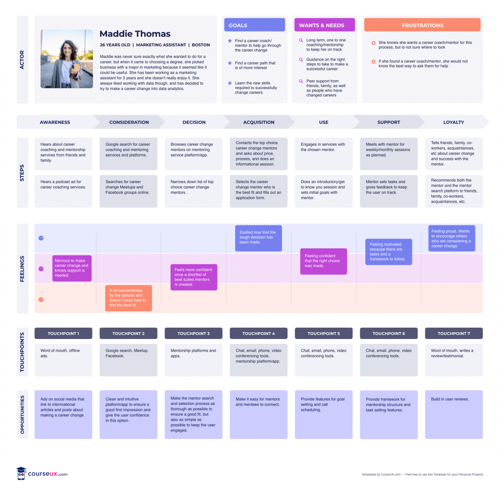
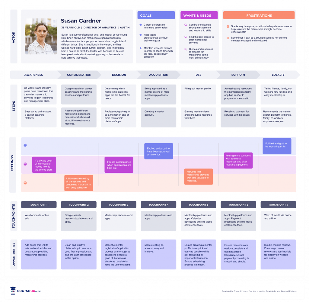
I took the mentee and mentor personas with the greatest business affinity for my app and created a customer journey map for each. I started piecing together what their journey relating to my app could look like, from awareness through to use and loyalty. I explored the thoughts and feelings they might have during each stage. This enabled me to see some of the potential opportunities to solve their problems.
Defining User Needs
After bringing together the commonalities across my user research, as well as my exploration with Empathy Maps, Personas, and Customer Journey Maps, I defined clear user needs.

Step 2: Ideate
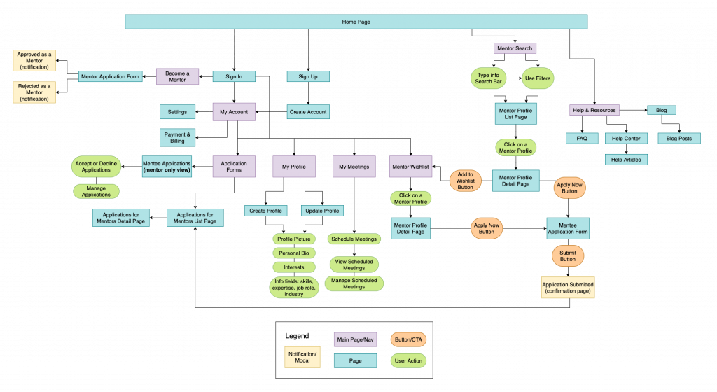
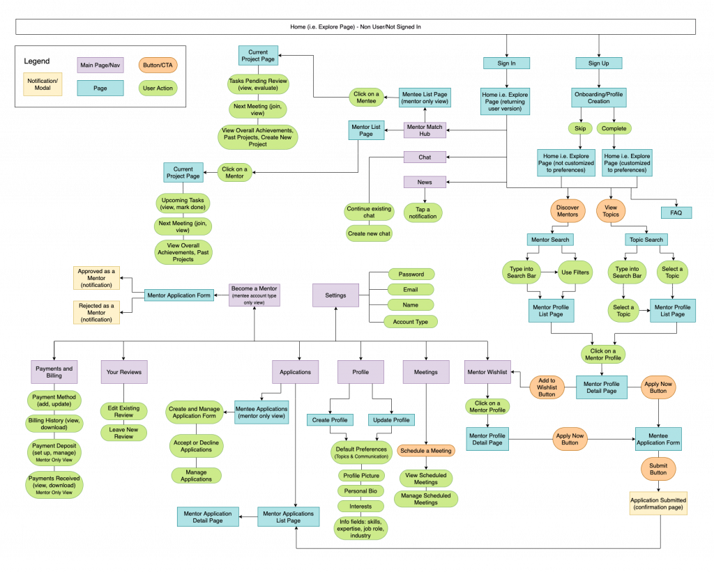
After defining user needs, I developed a sitemap, which was useful for visualizing and defining the basic structure of the app. By progressively updating the sitemap as I designed, I was able to keep track of all of the screens required and how they should link with each other. As I did rounds of user testing, my sitemap changed due to iterations after feedback.
Initial Sitemap
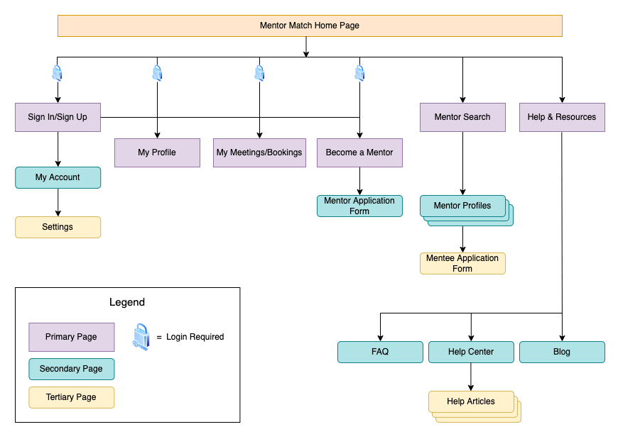
Updated Sitemap
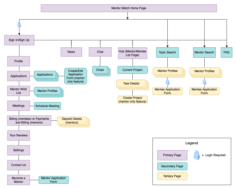
Then, I put together a simple user flow with some basic features. As I progressed with my designs and completed multiple rounds of testing, my user flow expanded.
Main differences between the initial and updated flow:
- Onboarding and profile creation flow, mentor search flow, and application flow were all further developed to better serve user needs
- Addition of the secondary navigation menu containing features which users are most likely to want quick access to (i.e. Mentor Match Hub, Chat, and News).
Low Fidelity Wireframes
During this stage, I established some fundamental features:
1. Mentor search and application
Mentee needs:
- Search based on skills and expertise
- Straightforward ways to connect with mentors
Mentor need:
- Pre-mentorship screening questions
2. Projects and tasks
Mentor needs:
- Help put a structure in place
- Exploring how gamification of projects and tasks might assist with mentee engagement and motivation
3. Meetings (schedule & manage)
Mentor need:
- Help put a structure in place
Step 3: Test - Low Fidelity Wireframes
I asked four people of varying ages and tech savvy to complete tasks related to the fundamental features outlined above. At this point in the process, all tasks focused on the mentee account type (I developed wires for the mentor account type once I had the mentee account type roughly defined).
Tasks:
- Search for a mentor and submit an application for that mentor.
- View your meetings and schedule a new meeting.
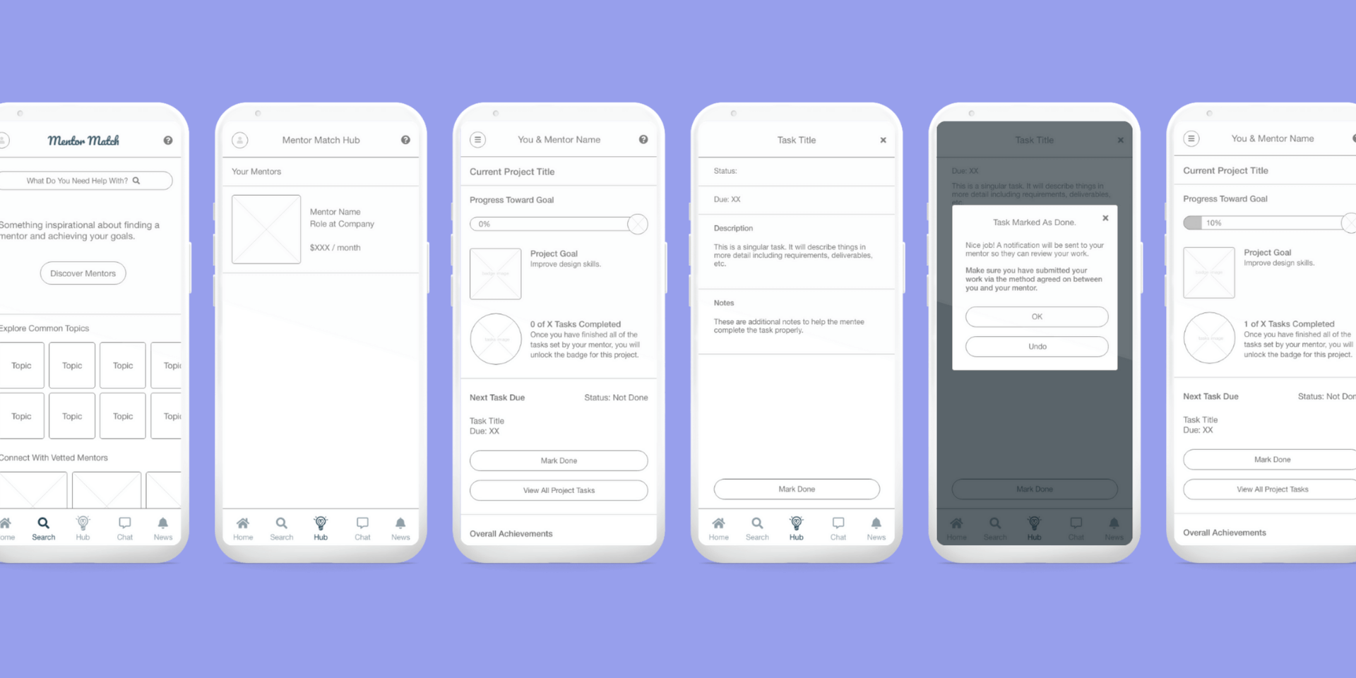
- View the tasks set by your mentor and mark one task as done.
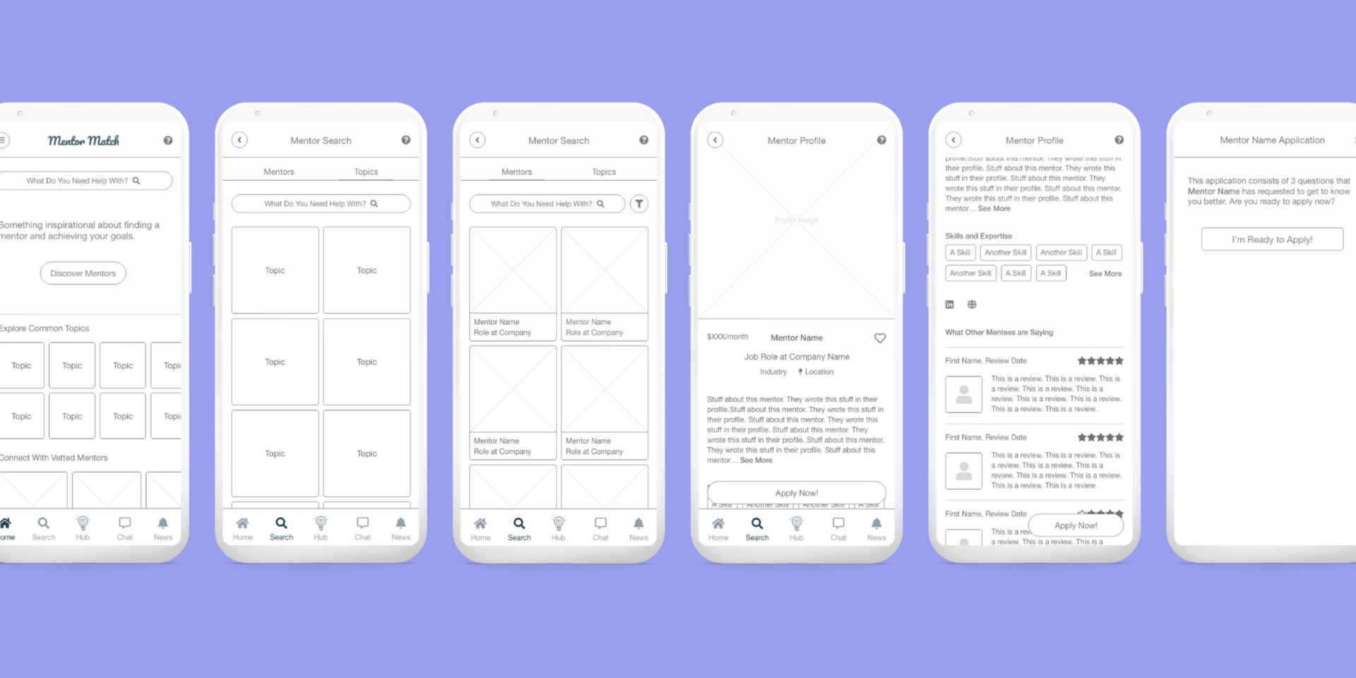
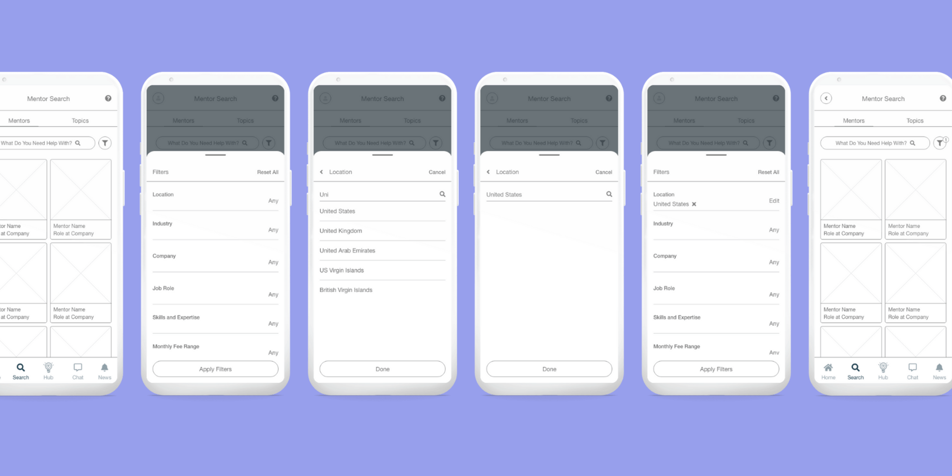
Task 1: Search and Apply for a Mentor
All testers found the search and application process to be straightforward, and no one had issues completing it.
Two testers chose to use the filter feature on the Mentor Search page, which they thought would be helpful in a real mentor search.
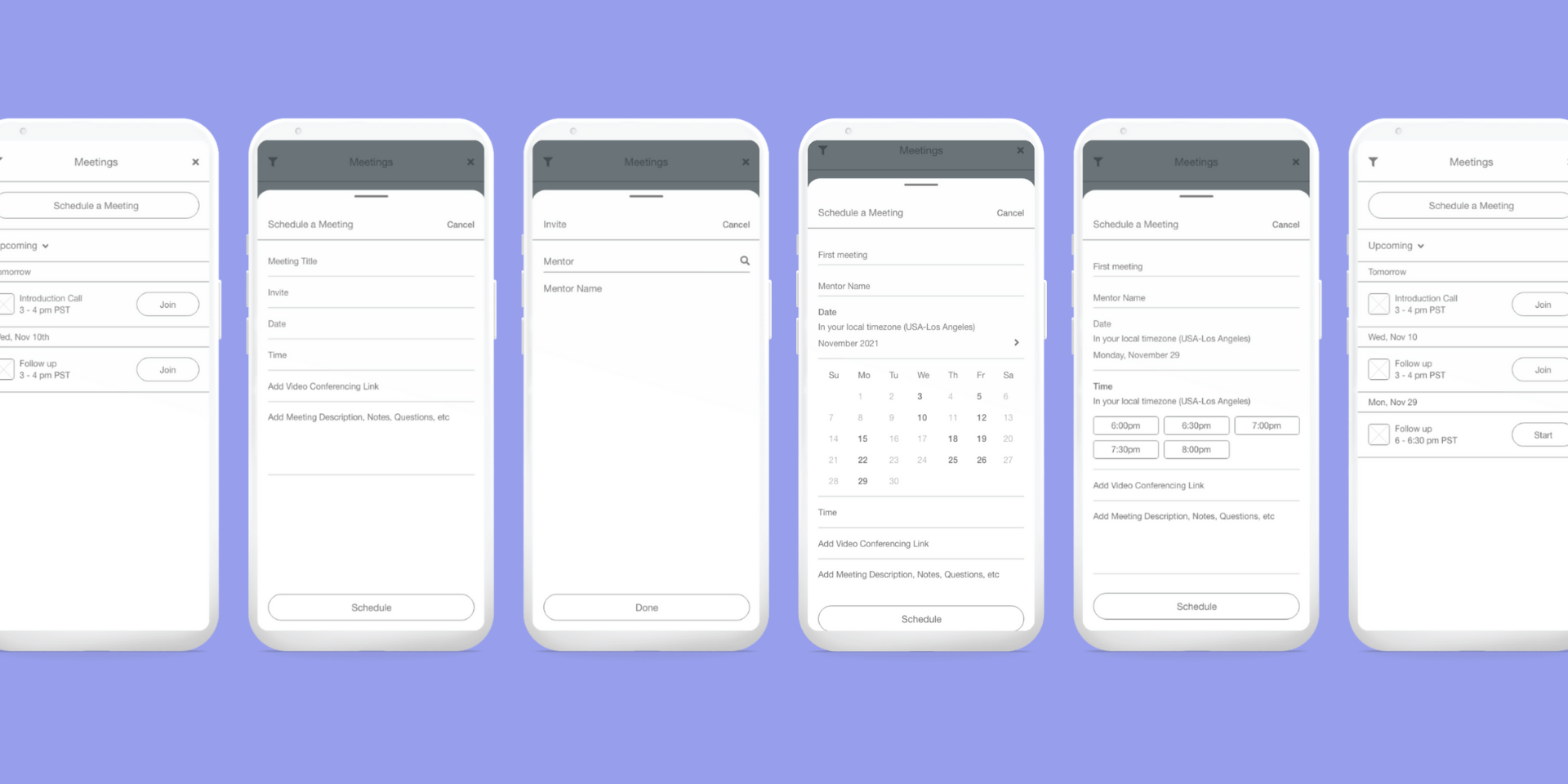
Task 2: Schedule and Manage Meetings
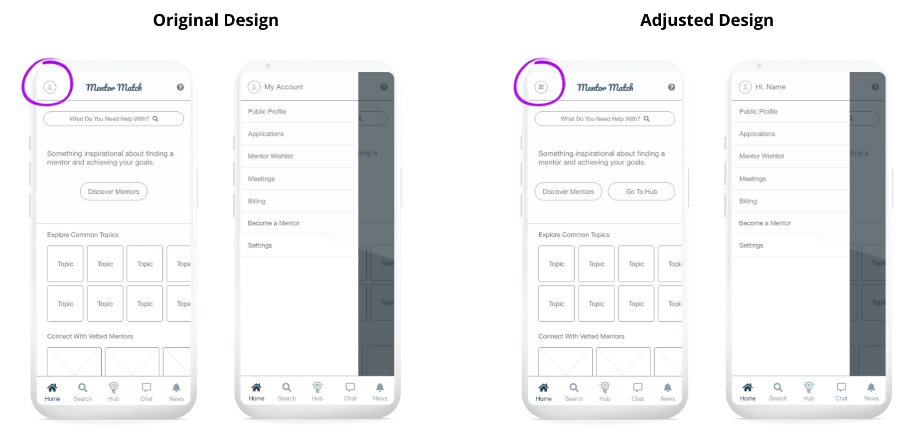
I noticed testers having trouble locating the meetings page, not realizing the profile image in the top left was a menu.
Solution: I replaced the profile image with a burger menu.
Why?
- The burger menu is a common pattern that many other apps use, so it is not an unexpected experience for the user.
- The profile image gives the user no real value other than showing them a picture of themselves, so the burger menu is a more practical solution.
Flow Optimization
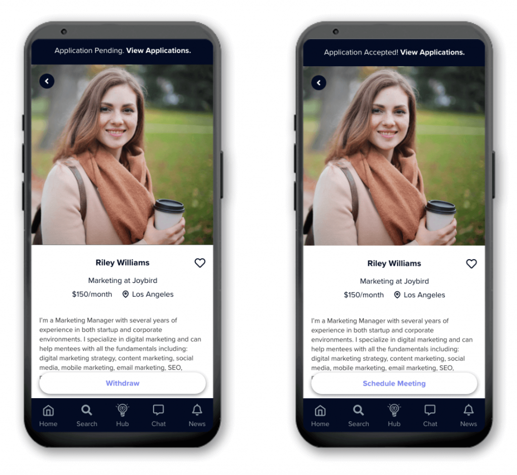
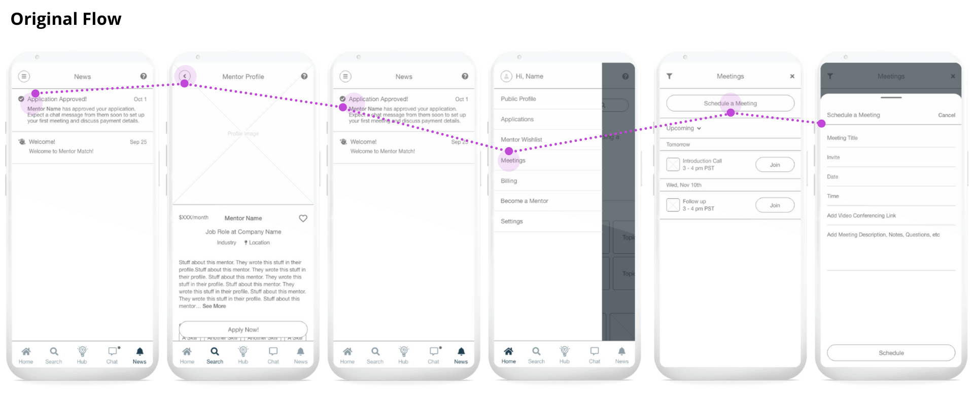
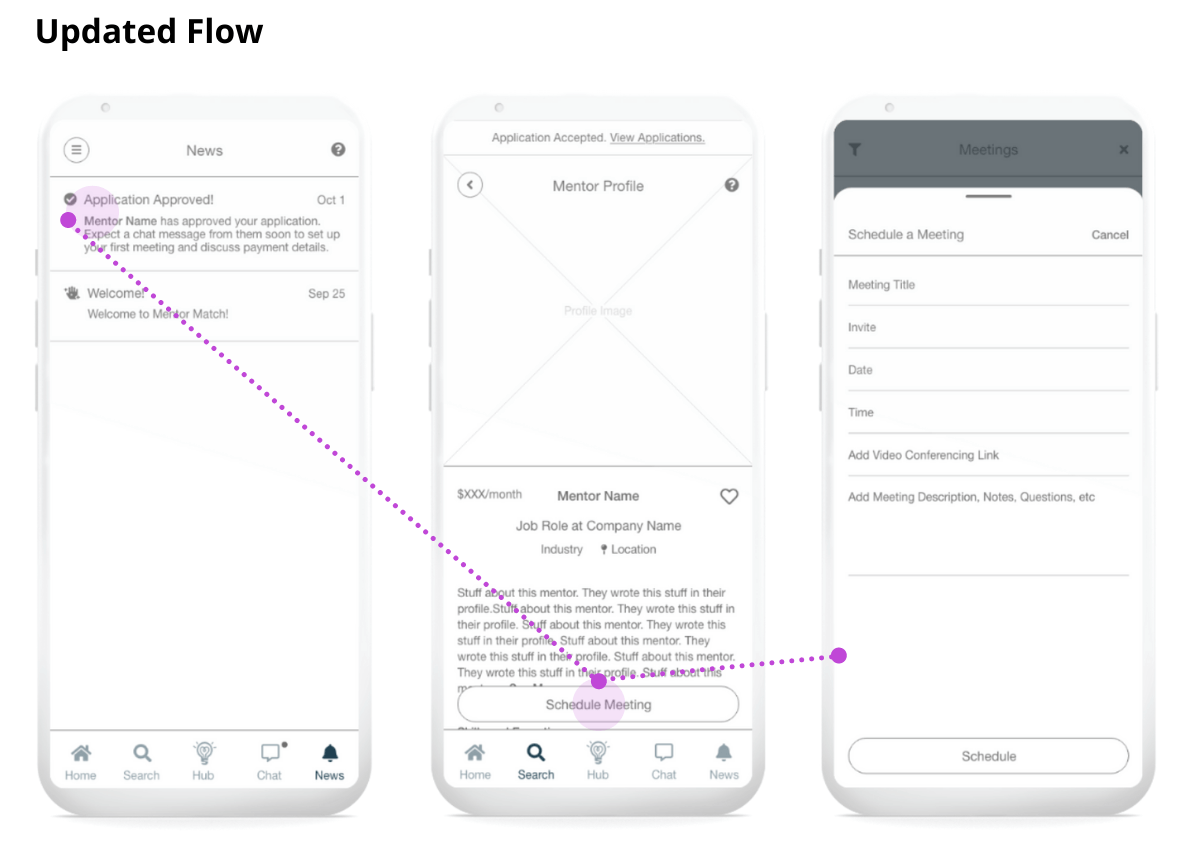
One tester said they would likely apply for multiple mentors. If a particular mentor approved their application, they would want to go back and refresh their memory on the details of that mentor's profile before scheduling a meeting with them. This is a valid use case that I decided to solve for.
Solution: I realized that once an application is approved, the Apply Now! button becomes redundant, but I could easily replace it with a 'Schedule Meeting' button. This reduces this particular flow from 5 steps to 2.
Task 3: View and Mark Tasks Done
Common feedback I considered:
- From the Your Mentors page, testers expected to see information that was more relevant to their goal for this part of the flow.
Solution: I adjusted the design from displaying how much the mentor’s monthly fee is, to displaying when the next task for the current project is due. - Once testers had clicked into the current project, they expected to see everything relevant to the project in this one central location - examples included quick links to see upcoming meetings with the mentor, recent chats from the mentor, etc. I considered this more during the high-fidelity stage.
Interpreting Feedback
Two testers had trouble locating their tasks because they were confused by the term 'Hub'. I explained:
Hub is defined as 'the effective center of an activity, region, or network'
In this case, the effective center is the Hub, and the activity is completing projects and tasks. While this helped with their understanding, testers suggested a term like 'Dashboard' instead.
I considered whether the term Hub is prohibitive to a user's path through the app. Are users going to keep getting confused? Or once they’ve used the app, will they remember what the Hub is?
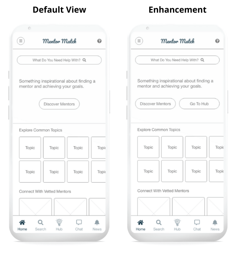
Solution: I decided the most likely outcome was option two - Hub is an easily learnable term. However I did make one enhancement - the addition of a 'Go To Hub' button on the home page. This will only appear once a mentee actually has projects and tasks to complete.
Step 4: Visual Design
Significant Decisions
1. Changing the logo
I wanted the logo to set the tone for the whole app - confident and straightforward, whilst also supportive and approachable. I felt that the typeface I ultimately went with was a better expression of this tone than the one I'd used in my low-fidelity wires.
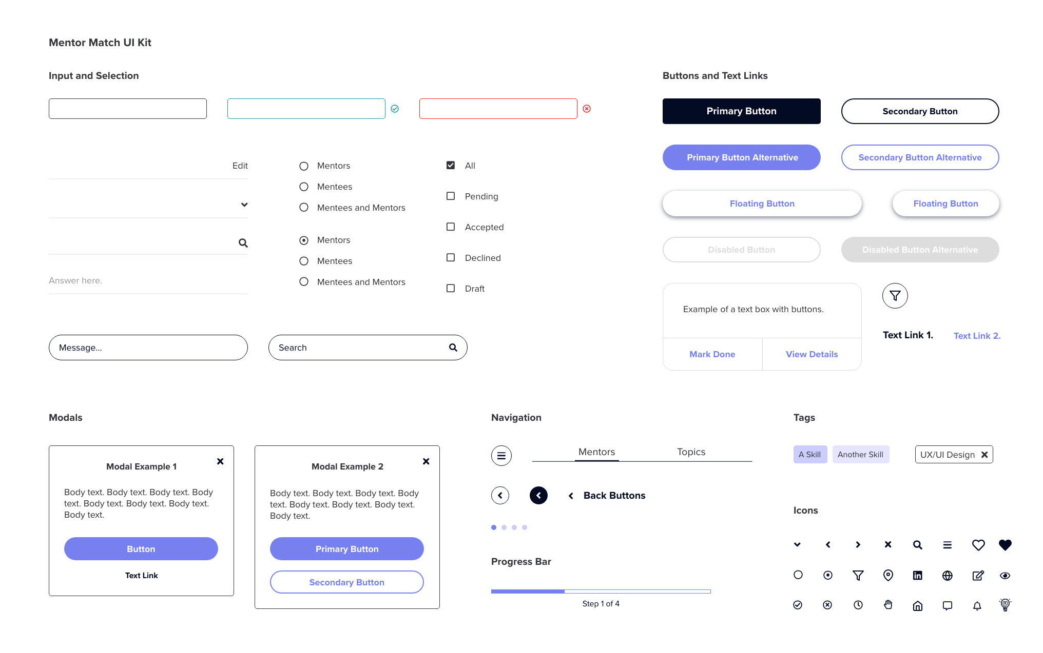
2. Icon consistency
My low-fidelity wires used a combination of solid and outline icons. I switched to all outline icons for a more modern feel and to give users a more consistent experience.
3. The light bulb motif
- Appears in a few places across the app (in the logo, the icon for the 'Hub', and the icon for the project progress bar)
- Light bulbs in a professional context symbolize knowledge, ideas, and growth
- Visually, the warm and/or bright colours of a light bulb evoke either a feeling of comfort and calm (when dimmed) or energy and enthusiasm (when bright)
- A light bulb helps you see when you are in darkness
My vision for Mentor Match was to embody all of this by being a guiding light for people who are tackling new challenges - which at first might seem daunting - like learning new skills, changing careers, going for new jobs, and so on.
Style Guide and UI Kit
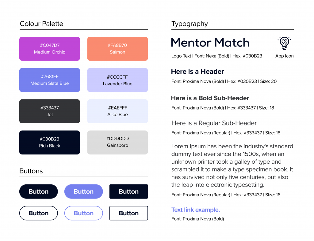
These helped to ensure everything remained visually consistent across the app, from colours, to typography, to all UI components. I updated both documents a few times as I discovered which colours, typefaces/fonts, and icons best captured the visual feel I aimed to achieve (mostly minimal and calming with some pops of bright energetic colour), while still being user friendly.
High Fidelity Wireframes
I expanded on the fundamental components defined in the low fidelity wireframing stage, and added capabilities to further solve user needs. Since I had established some patterns for use throughout the app per the UI Kit, I felt confident to move forward in high fidelity only, designing new features and capabilities whilst simultaneously adding colours, typefaces/fonts, images, and improving the overall layout.
During this stage, I developed:
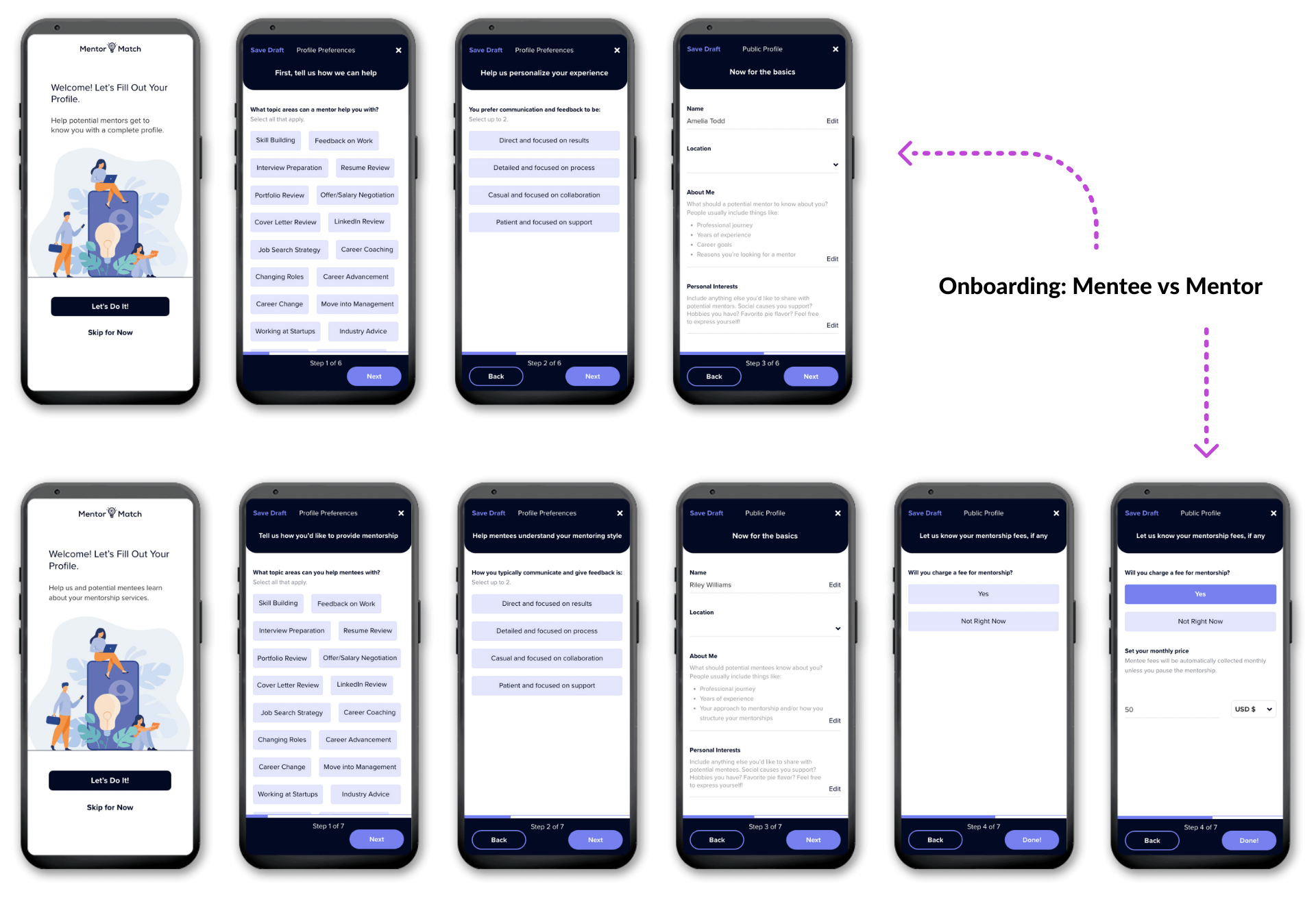
1. A more robust onboarding process
Mentee need: Search based on skills & expertise, and communication style
Mentor need: Optional monthly fee collection
2. Application form creation & application management
Mentor need: Pre-mentorship screening questions
3. Mentor Match Hub Enhancement
Based on feedback from low fidelity wireframe usability testing
4. Improved UX Copy
Sets the correct expectations
Reduces friction points
Step 5: Test - High Fidelity Wireframes
I brought back the same four people who had tested my low-fidelity prototypes to:
- Test the new features I'd added
- Comment on the improvements I'd made since the last testing stage
Connections via Skills, Expertise and Communication Style
I wondered how I could capture communication style in a filterable format. I took inspiration from the DISC personality assessment. It categorizes people into 1 - 2 of four personality types, which directly correlate with communication style. I summarized the characteristics of each personality type into its own distinct phrase.
Once a user has completed onboarding, their mentor search page is personalized to show only those who match their preferred communication style as well as the topic areas they selected.
Straightforward Ways to Search for Mentors
The app offers Mentor based and Topic based search options. All testers used either one option or the other.
Three testers were encouraged and confident enough after seeing the hero component to click the CTA button immediately. The one who scrolled down further would tap 'View More Topics' first. They wanted to understand topic areas mentors can help with and choose a mentor accordingly.
Would this help? Tester responses...
“Topic selection helps you narrow down and feel like your concerns are common, relatable, and achievable.”
“Communication style selection makes you feel confident knowing your needs are being taken into consideration.”
"Would help me spend less time endlessly searching for mentors, so I can narrow down the best options more quickly.”
“You're more likely to end up with a suitable match based on expertise and style, which would result in a better outcome.”
Creating a Seamless Experience.
Throughout the app, I designed the mentor side to fit in seamlessly with the existing mentee side. The onboarding and profile creation processes share the same flow, but the copy has been adapted to suit each account type. Additionally, an optional monthly fee collection step has been added for mentors.
Improving Text Prompts.
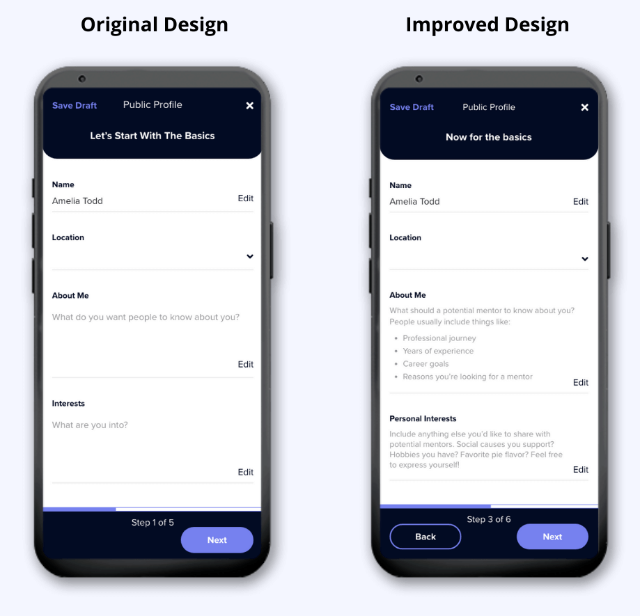
During profile creation, testers agreed that it was unclear what to write in the 'About Me' and 'Interests' sections. Feedback of note:
- I need more direct and leading questions
- I would like to know what other people write or what the app suggests
- I'm not sure what the difference between 'About Me' and 'Interests' is, or if one is more important than the other
Solution: I included more helpful text prompts, plus a larger 'About Me' and a smaller 'Personal Interests' section.
Pre-Mentorship Screening Questions
Mentors can create a single application form to ask screening questions of their own choosing before accepting a new mentee. Switching the application form off will remove their profile from search results until they switch it back on.
Addressing Friction Points.
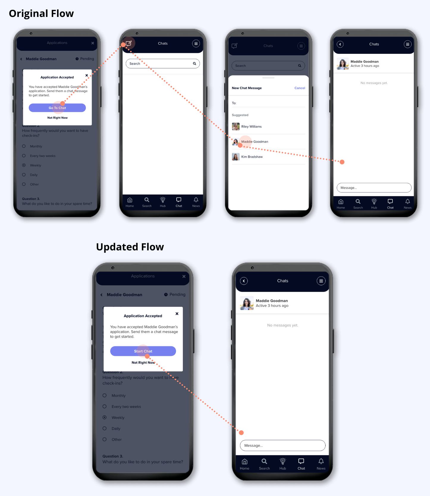
I noticed a common friction point once testers had approved a mentee application. Testers understood the recommended next action, but the screen that appeared after clicking 'Go To Chat' was unexpected based on the modal copy.
- Expectation: Be taken automatically to an open chat with the new mentee.
- Reality: Taken to the chat list page, where a new chat with the mentee needs to be manually created.
Solution: I cut out the two middle steps to help mentors achieve the action more efficiently.
Providing Structure for the Mentorship
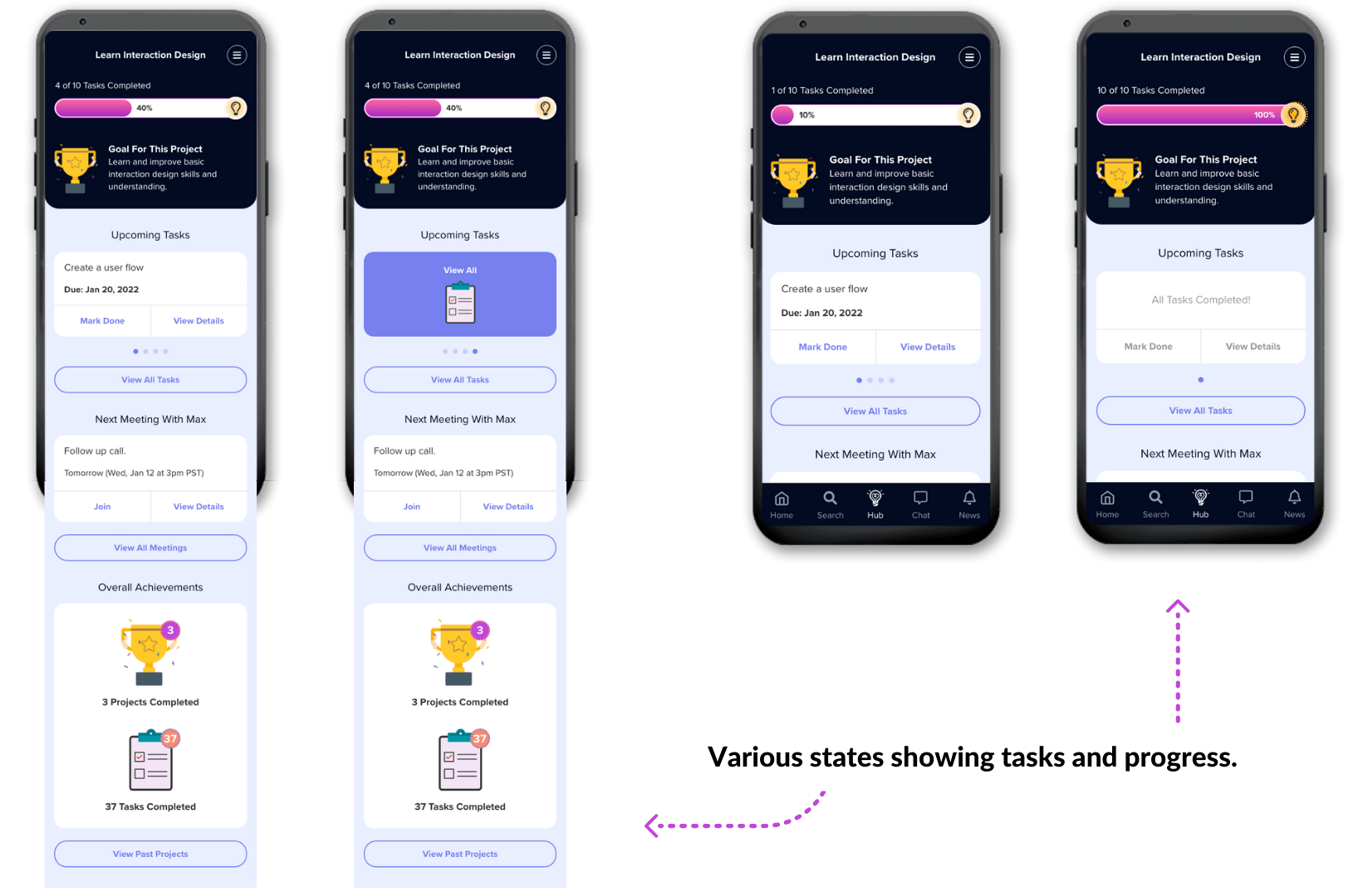
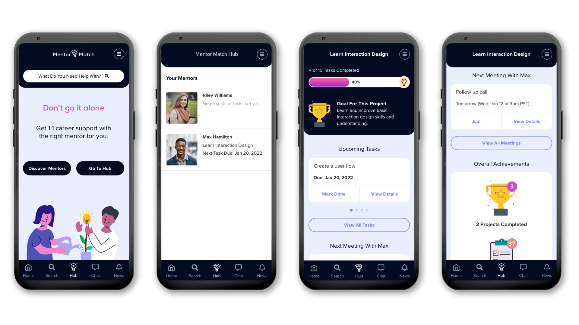
Using the Hub, Mentors can introduce structure by creating a project based on a specific mentee goal, then setting tasks for the mentee to achieve that goal.
To bring more value to the project page, I implemented previous feedback and added upcoming meetings. This way, the most important details regarding the project are in one central location.
Could this work? Tester responses...
"Would keep me motivated by having one place that already tracks my goals and deadlines - I wouldn't have to keep another list somewhere I that I might forget about."
"The gamification and small visual reward would keep me engaged. Completing the progress bar would be satisfying."
"It makes it easy to mark tasks off and alerts my mentor, so I would have motivation to complete the task."
Learnings: How I've Improved as a Designer
Up until I started this project as part of my UX course, I was almost completely self-taught, just taking guidance from a mentor of mine. I was very lucky to get the opportunity to do some interaction design work at my last company. But other than that, I was just Googling things like 'how to design an app', on the weekend and then jumping on Adobe XD to figure it all out.
Needless to say, I've learned SO MUCH from this project. For me, these were the biggest areas of impact:
User Research
From my marketing degree, I was familiar with the idea of conducting surveys and interviews to extract common themes, and presenting an analysis. However I learned just how much the rest of the research activities help to crystalize what it is that potential users really want. From empathy maps, to personas, to customer journey maps, each stage enabled my mind to process the survey and interview analyses in different ways. Through these exercises, I could develop an informed opinion on not only what potential users say they want, but what they feel, what they think, their frustrations, their goals, etc.
User Testing
Having been on the receiving end of product feedback in a customer success capacity, the only thing you can really do is pass it onto designers and let them decide if it is important. It was so interesting to be on the other side, deciding what was important! I was both surprised and delighted by how insightful user testing was. My testers all provided valuable feedback and made me aware of things I hadn't even considered. However, another thing I learned is that sometimes what people say they need isn't necessarily what they actually need. So it is important to know when to take a suggestion at face value and when it's necessary to infer things to design the best solution.
Prototyping in XD
Overall my XD skills significantly improved throughout this project. The thing that had the biggest impact was understanding how to properly create and use components, particularly for use in click prototypes. Additionally, I am much more familiar with XD's prototyping capabilities in general, and I'm pleased with how real I was able to make my wires look (though I want to improve even more).
Ultimately, this project was an initial exploration of mentor and mentee problems to develop an MVP. There are always going to be ways I can improve my designs. I think this is one other important thing about being a designer - acknowledging that user needs will develop and change, and our solutions are never 'done' - they are just the best ones we've come up with to fit needs and constraints at a certain point in time. Designers must continually iterate and find ways to improve.
Illustration credits: Hannah Chen, pch.vector from www.freepik.com, Amethyst Studio from NounProject.com


