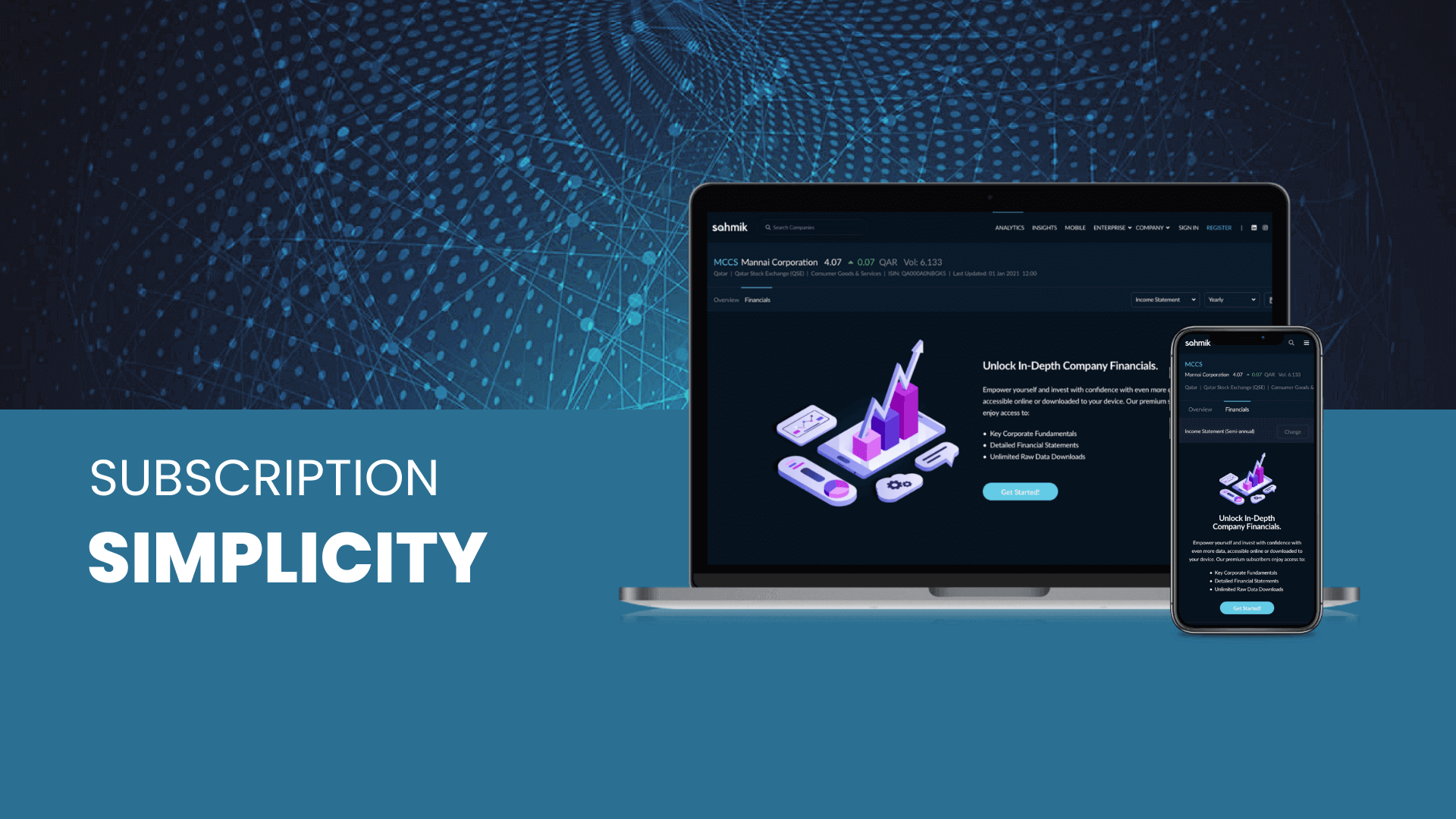
The Problem
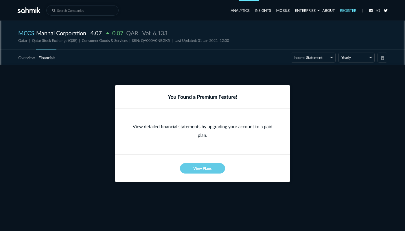
Sahmik wanted to introduce a subscription model with gated content. When I started working with them as a freelance interaction designer, basic account registration and management was being built, but no subscription process had been designed yet. My role was to design the display for gated content as well as subscription selection (after registration) and management flows. This had to be done for both desktop and mobile.
Defining the flow (the 'happy path')

Subscription Selection (at registration)
The journey from gated content to subscription selection aimed to be as short and simple as possible. Upon registration, users are automatically subscribed to the free plan and given the option to select a paid plan or simply continue to their new account.
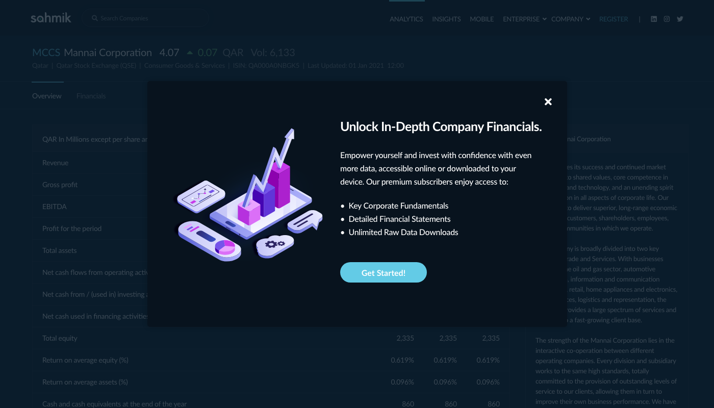
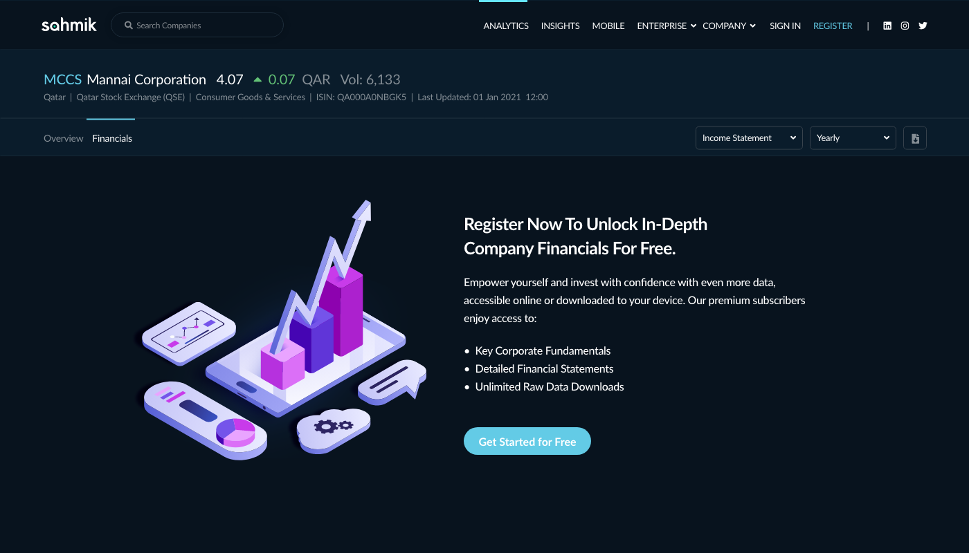
Upgrade Prompt Iterations
The upgrade prompt went through a few iterations before settling on the prompt shown above. I explored different options that included changes to the UI, UX copy, and CTA copy. The goal was to have an eye catching prompt that communicated the most value in the least words, and provided a clear next step for the user.
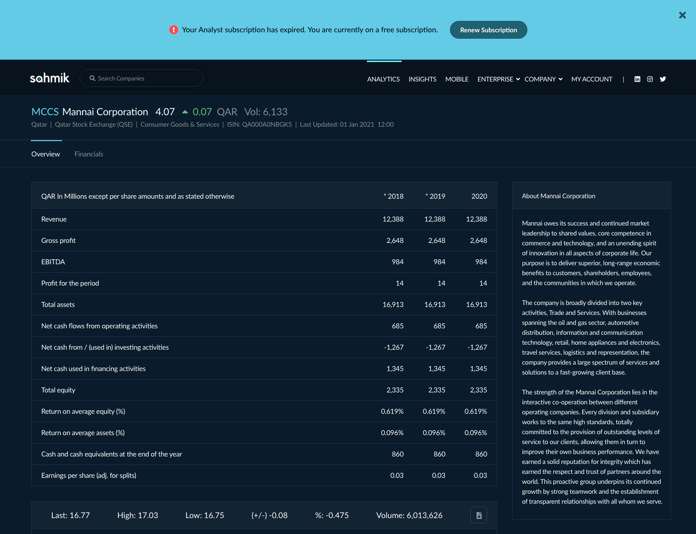
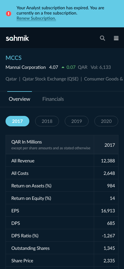
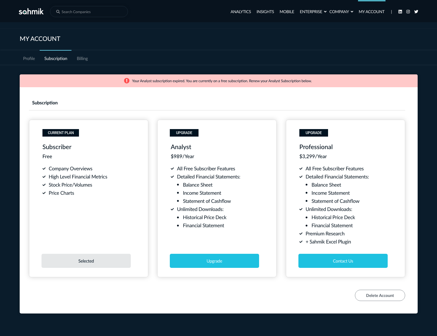
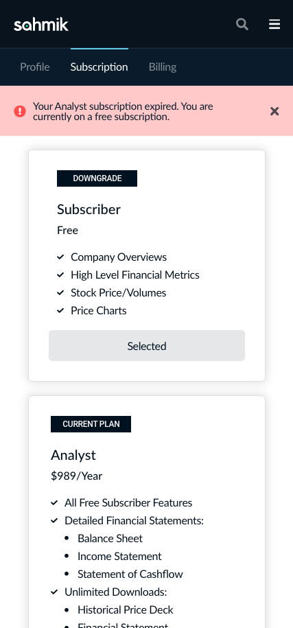
Subscription Management and Alerts
Subscription management aimed to be as transparent as possible, providing users with clear and concise information that is easy to find at the relevant point in time.

A Financial Services Platform just for the Qatar Stock Exchange
Sahmik is an early stage financial services company offering a financial information search engine specifically for the Qatar Stock Exchange. Its range of offerings includes a portfolio manager for users to explore, track and manage stocks with in-depth metrics. Sahmik's mission is to improve access to financial data in Qatar, giving everyone the insights and opportunity to participate in the region's continued growth and success.
As a freelance interaction designer at Sahmik, I assisted with the design of key features and a mobile optimized responsive site.
