The Problem
Internal analysts have one primary goal when underwriting a property for sale: Communicate the value of the property as quickly and effectively as possible, so that clients can take swift action - i.e. make an offer (or not)
Underwriting a home is a step by step process. Entera has a Gold Standard process that analysts must follow. However as the company grew, we started to hear about some problems...
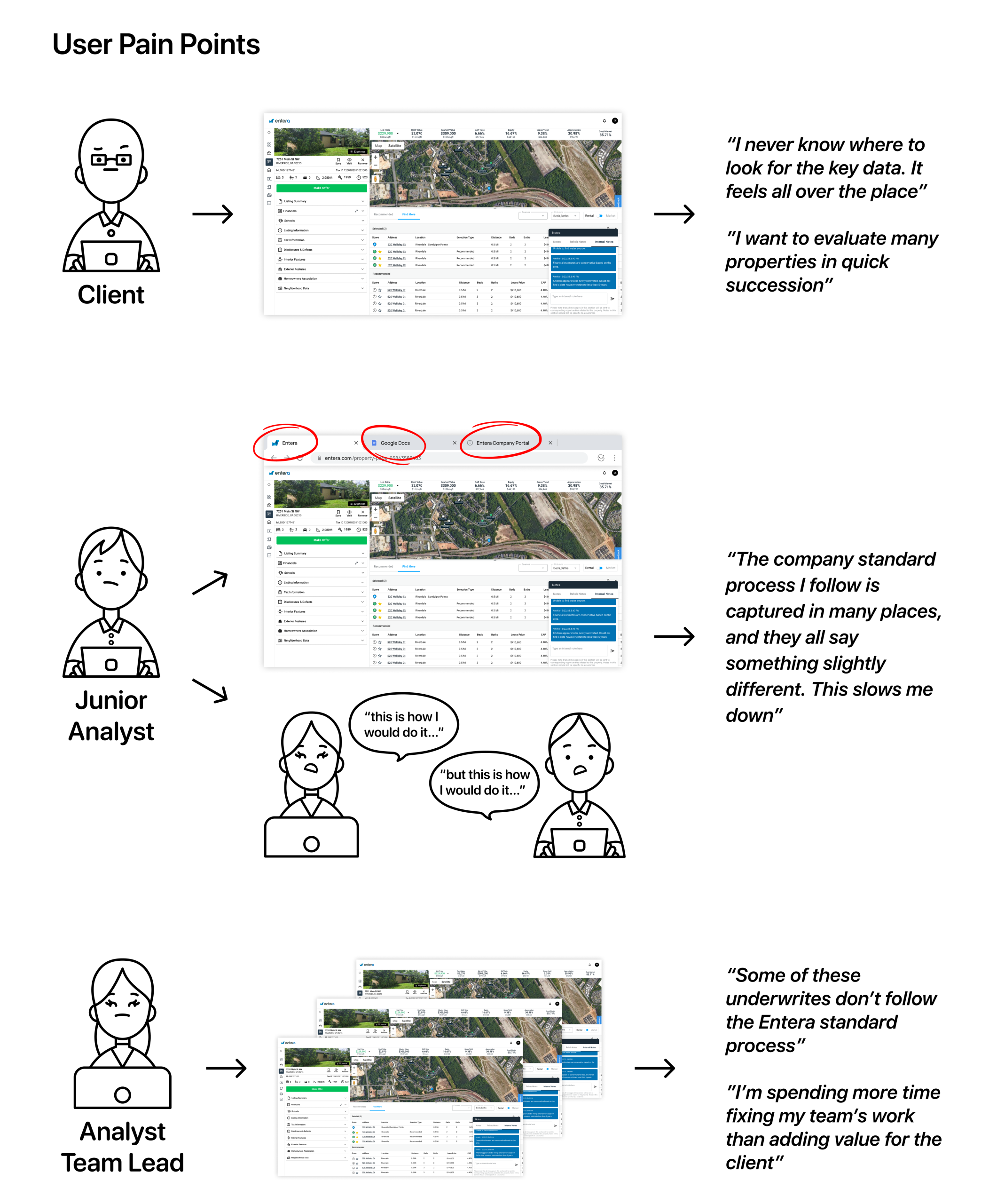
1. Consistency issues in what was supposed to be company standard work
- Underwrites performed differently based on analysts' personal preference and skill
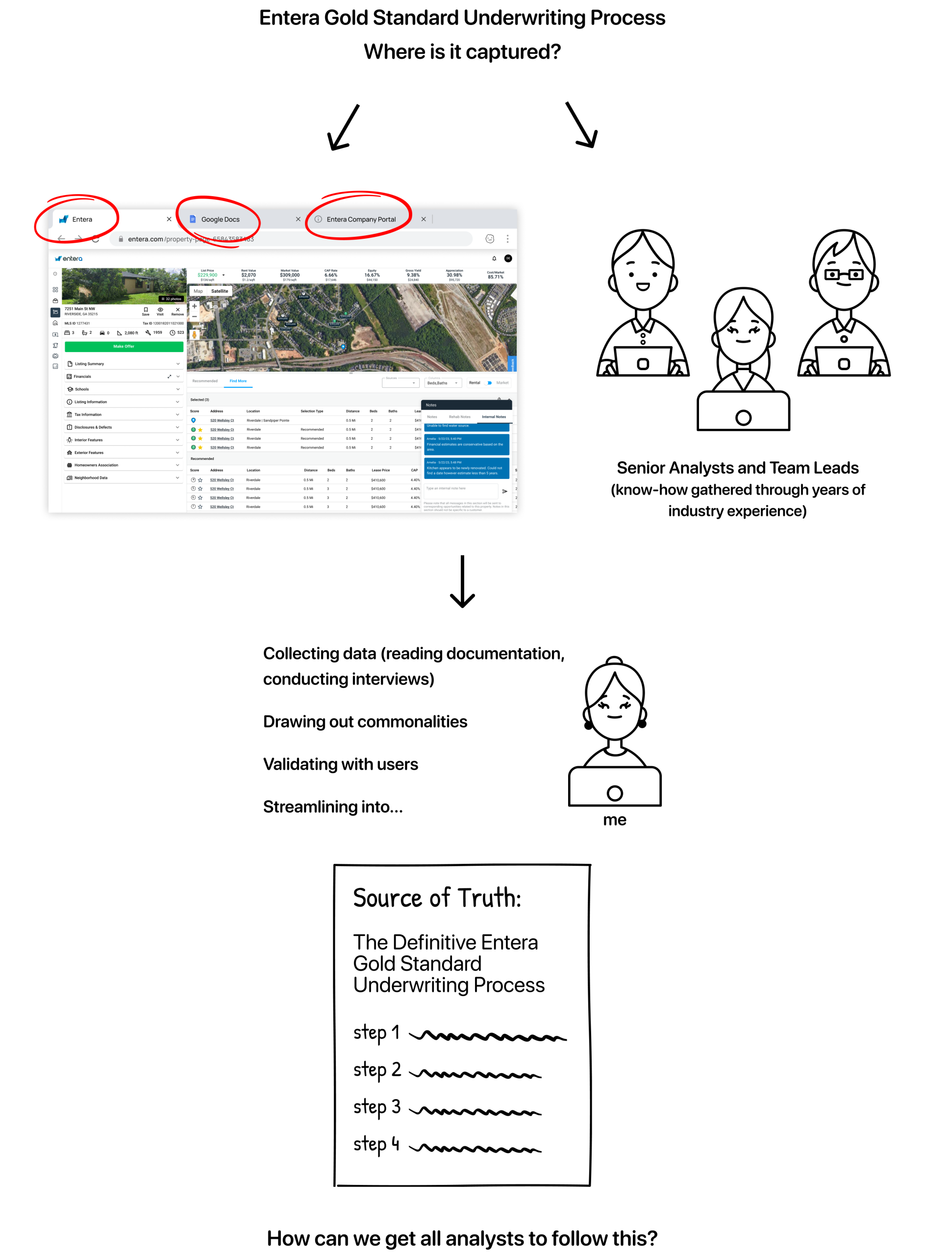
- Dispersed underwriting standards and processes (google docs, analysts’ heads, etc)
- Free text notes = free-for-all
- Concerns regarding the implications once underwrite sharing was enabled (see phase one)
2. Different Users, Different Goals
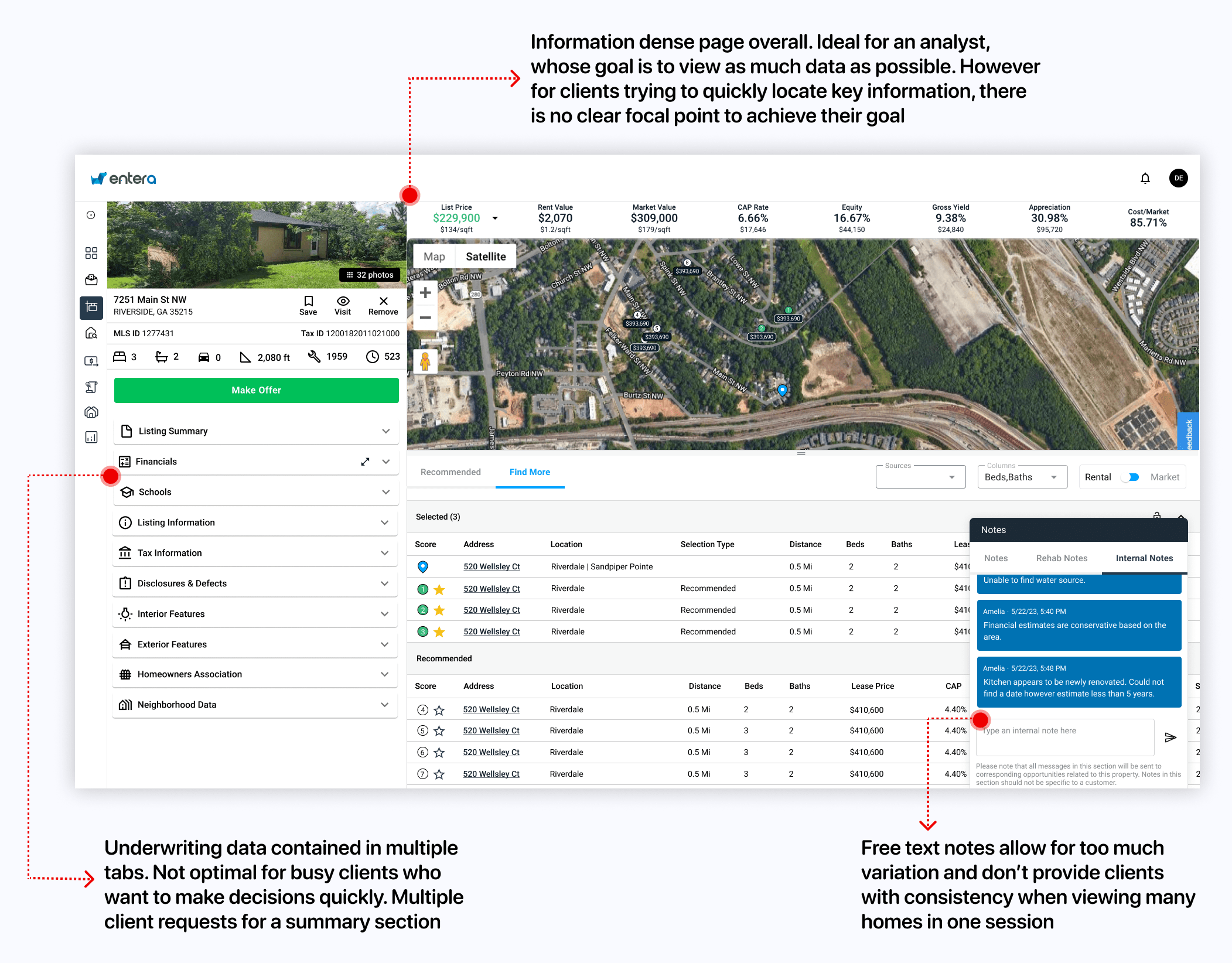
- Internal analysts want to see as much data on one page as possible, but clients do not
- Busy clients complained of an information dense property detail page
- Clients couldn't assess the value of a home quickly enough to take action before their competitors did
- Significant numbers of client requests for a summary of key details for an underwrite
Exploration
I attended regular meetings with the project PM and internal analyst team leads to:
- Understand and confirm user needs for three user groups:
- junior internal analysts who were completing the underwriting
- analyst team leads who were reviewing the junior analysts work
- clients who wanted to view key insights from the underwrite
- Capture requirements and translate these to user flows and features
- Present and test design ideas through high fidelity wireframes and prototypes
My starting point was to nail down the currently dispersed Entera standard underwriting process through...
...Research
After conducting user research, as well as brainstorming sessions with the product manager and analyst team leads, I defined project scope:
1. Integrate the process into analysts' workflow
Capture the company standard underwriting steps in a user-friendly question/answer format. Key requirements established during collaborative discussions were:
- The entire form should be accessible on the page of the home being underwritten
- The form should not obstruct key information on the home’s detail page
- The form should have mandatory steps restricting submission until completed
2. 'Quick-view' option for clients
Upon form submission, the answers should appear on the client side in a format that is consistent in both information captured and layout, thereby increasing scannability. Clients needed a summary of the underwrite with enough detail and consistency to take swift action on the home.
Design Iterations
The above discussions led to three main iterations, outlined below. Prior to starting design, I created user flows to guide my work and make sure no steps were missed.
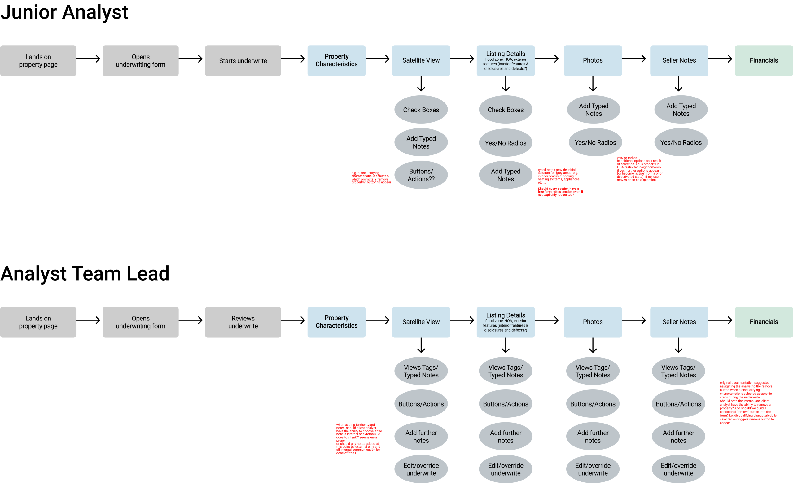

Iteration One: A step by step wizard that followed analyst around the screen
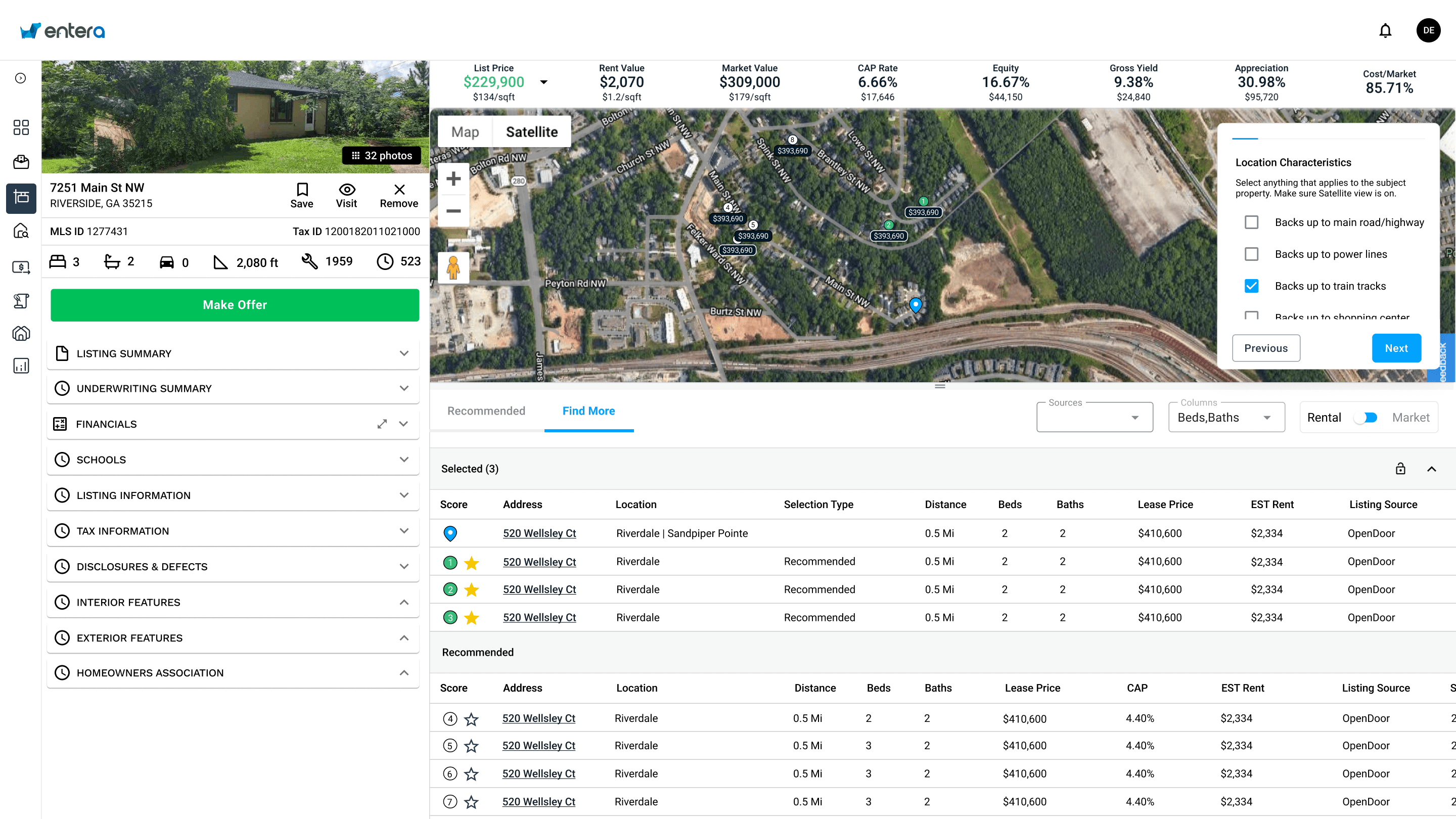
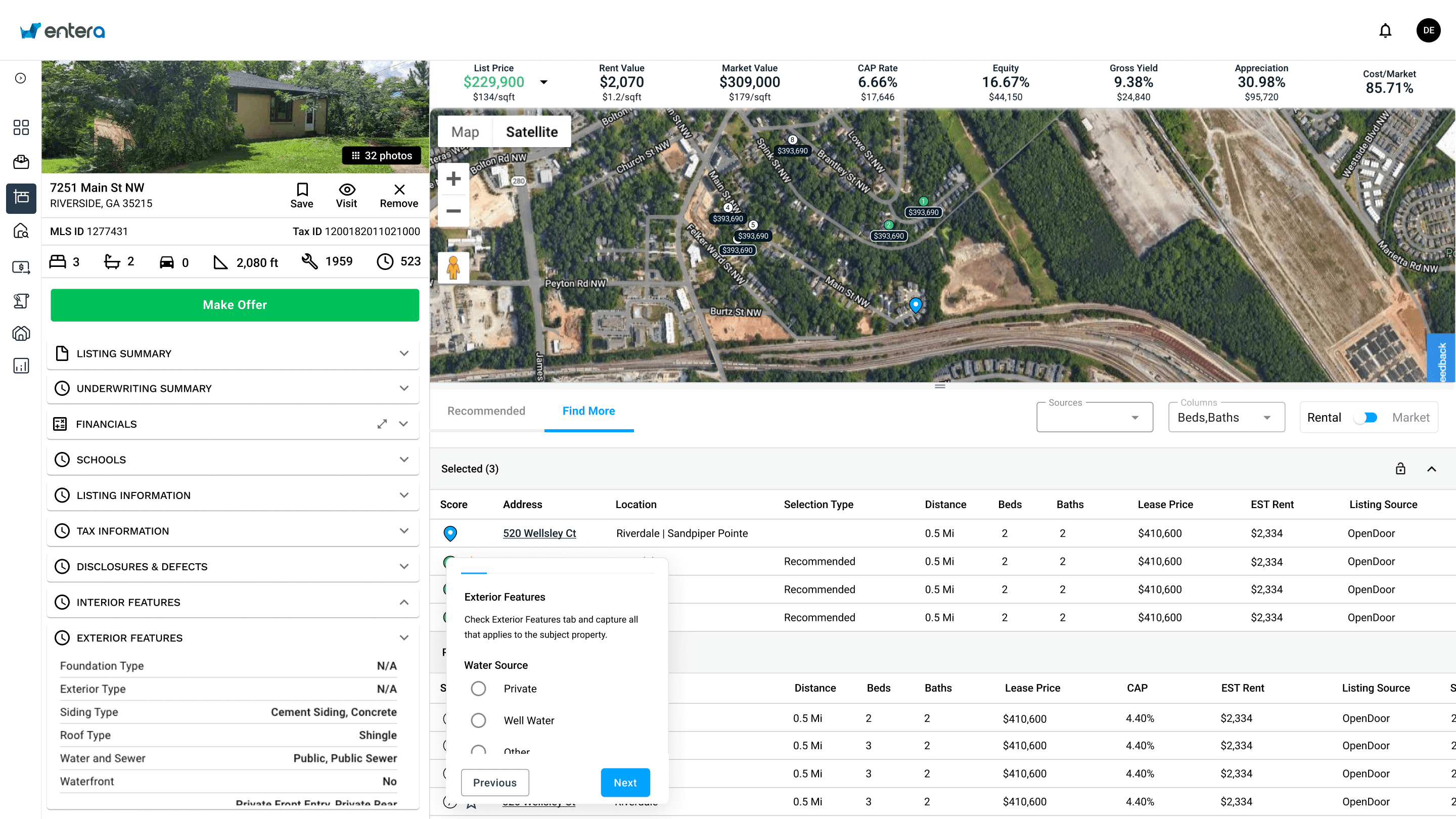
This was the initial idea suggested by the internal analysts. This was a 'wizard' format where a dialog box containing the relevant questions would appear in different areas of the screen, depending on which underwriting step was being completed.
This idea was discarded because it forced the analysts to complete the underwrite in a particular order. After user testing we concluded that:
- Ensuring that all the steps were completed at some point was more important than the actual order in which the steps are done
- While the steps are mandatory, each analyst had their own preferences in terms of the order, and forcing them to change their workflows was too great a cost. In later iterations, emphasis was placed on verification errors just to make sure all steps were completed at some point during the underwrite.
There were also concerns about the idea of the dialogue box changing positions around the screen, as well as not being able to view all the steps simultaneously. After user testing this was determined to be too jarring to the experience.

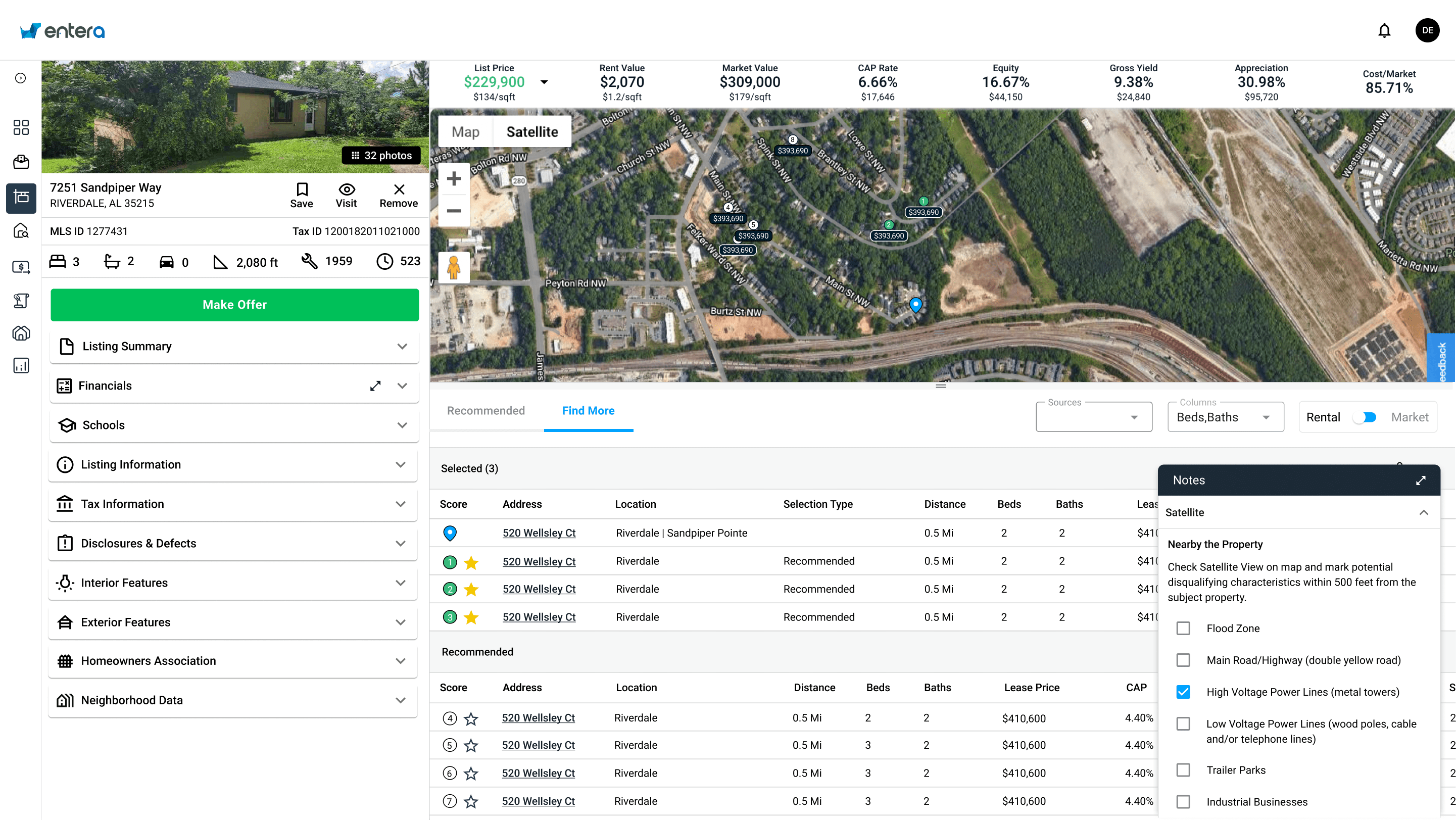
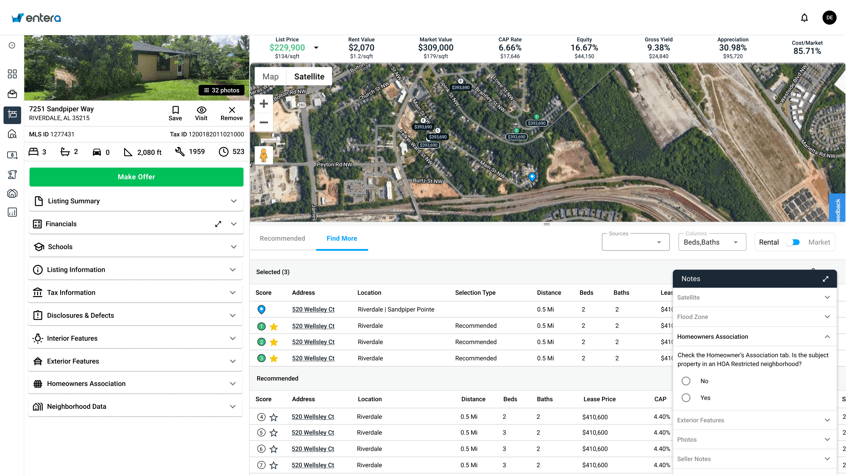
Iteration Two: A form in the notes section
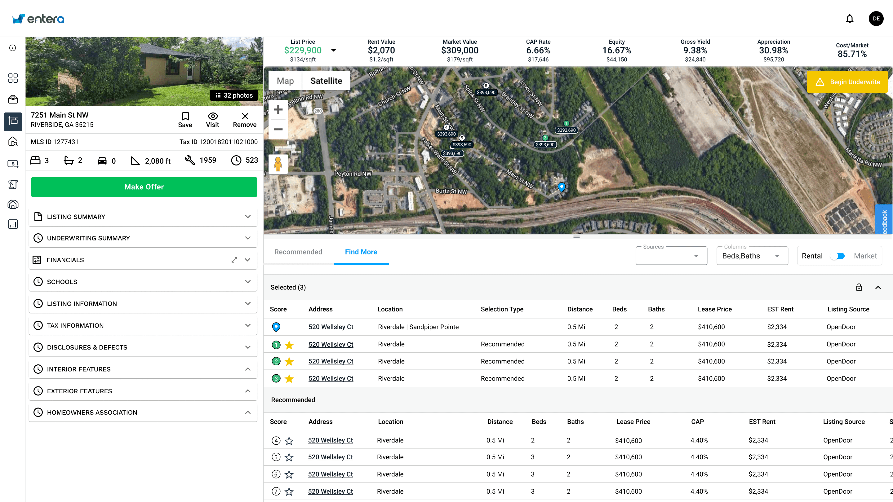
A second idea that I proposed was to repurpose an existing pattern on the home detail page - the free text notes section. The current notes section was used by analysts to call out key information or make additional clarifications about their underwrite. There had been initial discussions about potentially having the underwriting tags (which resulted from completing the wizard) replace the need for notes. So, I thought we could repurpose the component that was already built. An additional feature I suggested was a way to expand the notes section, since some underwriting steps included many questions.
This idea had to be discarded because there were future projects on the roadmap involving enhancements to the notes section in its current state. Additionally, there were concerns that navigating the notes section could be cumbersome since there was an extra click involved to expand. Plus, the notes in the expanded state obstructed some key information and actions on the page used to complete underwrites quickly.


Iteration Three: A form that opens in an additional panel
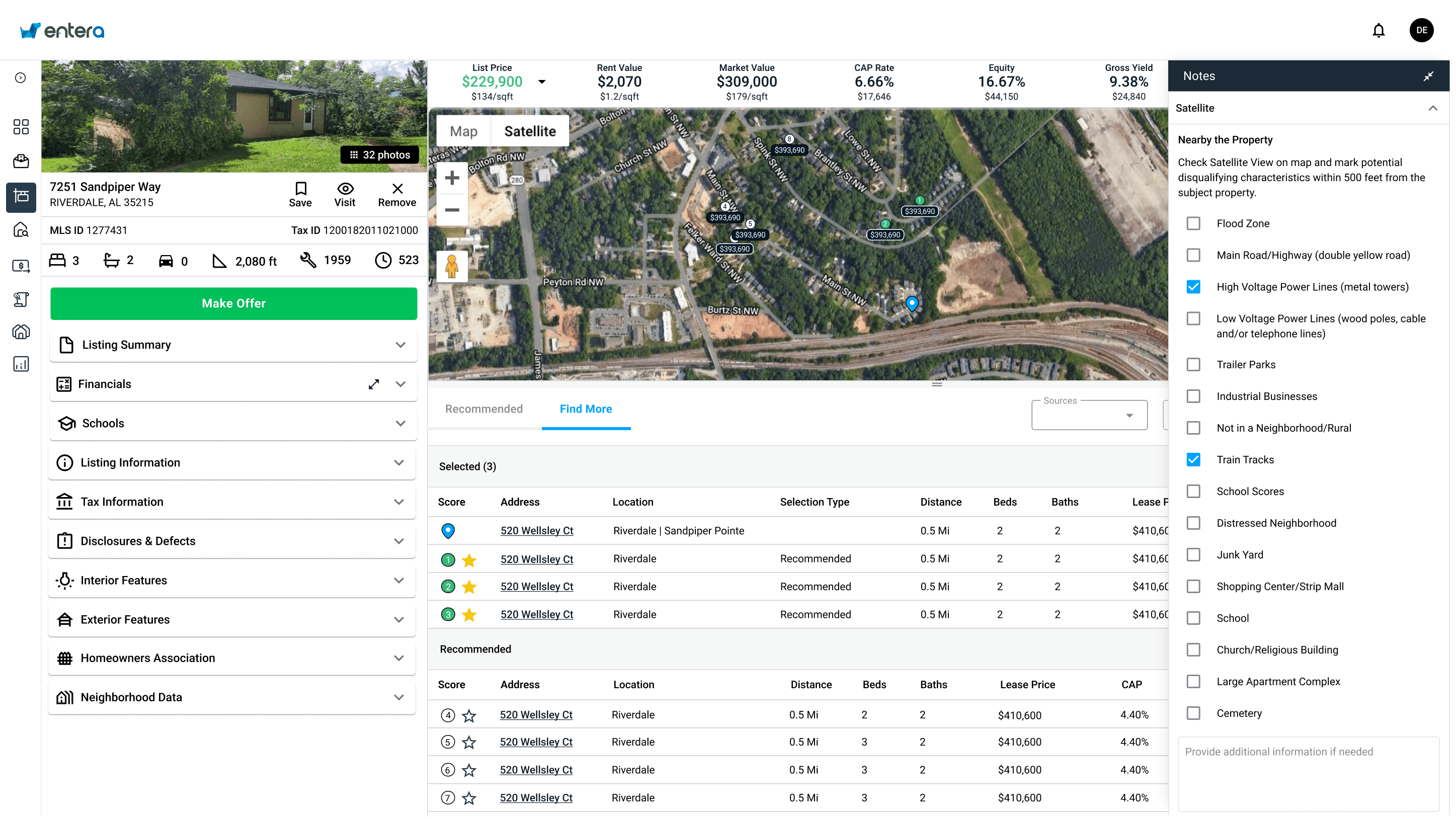
I workshopped this idea with the Director of Engineering while we were discussing ideas for a concurrent project I was assigned to. There had been multiple user requests to add an expand button to the accordions in the left-side menu on the home detail page, since some of these were very info/text heavy and took a long time to scroll through to find key information.
We realized we could expand this idea to the underwriting wizard project by:
- Adding a new accordion menu to contain the tags that resulted from completing the wizard
- Having an expand button on the new accordion menu that would open the underwriting wizard (i.e. form)
When presented to the project group, this idea was deemed to be the best fit for the analysts’ workflow and needs. It was also the least disruptive for clients, since they were already used to viewing information in the accordions. The bonus was that we could get a head start on establishing a pattern for the expand accordion feature which had been requested.
Junior Analyst View: Starting the underwrite
Analyst Team Lead View: Reviewing the underwrite
Feedback and Impact
The new tools were received positively, with some minor usability issues reported that were scheduled for a future release. Notable feedback included:
- Junior analysts: The wizard took the guesswork out of the underwriting process, so they could just focus on completing the steps competently. This decreased the time it took to complete a single underwrite, enabling them to hit their targets more easily
- Analyst team leads: The tags section made it much faster to review the junior analysts’ work, and easily make edits or additional comments if needed (previously they needed to read through the free text notes). This meant they could focus on adding value to the underwrite for the client, rather than spending too much time checking work or doing the entire underwrites themselves
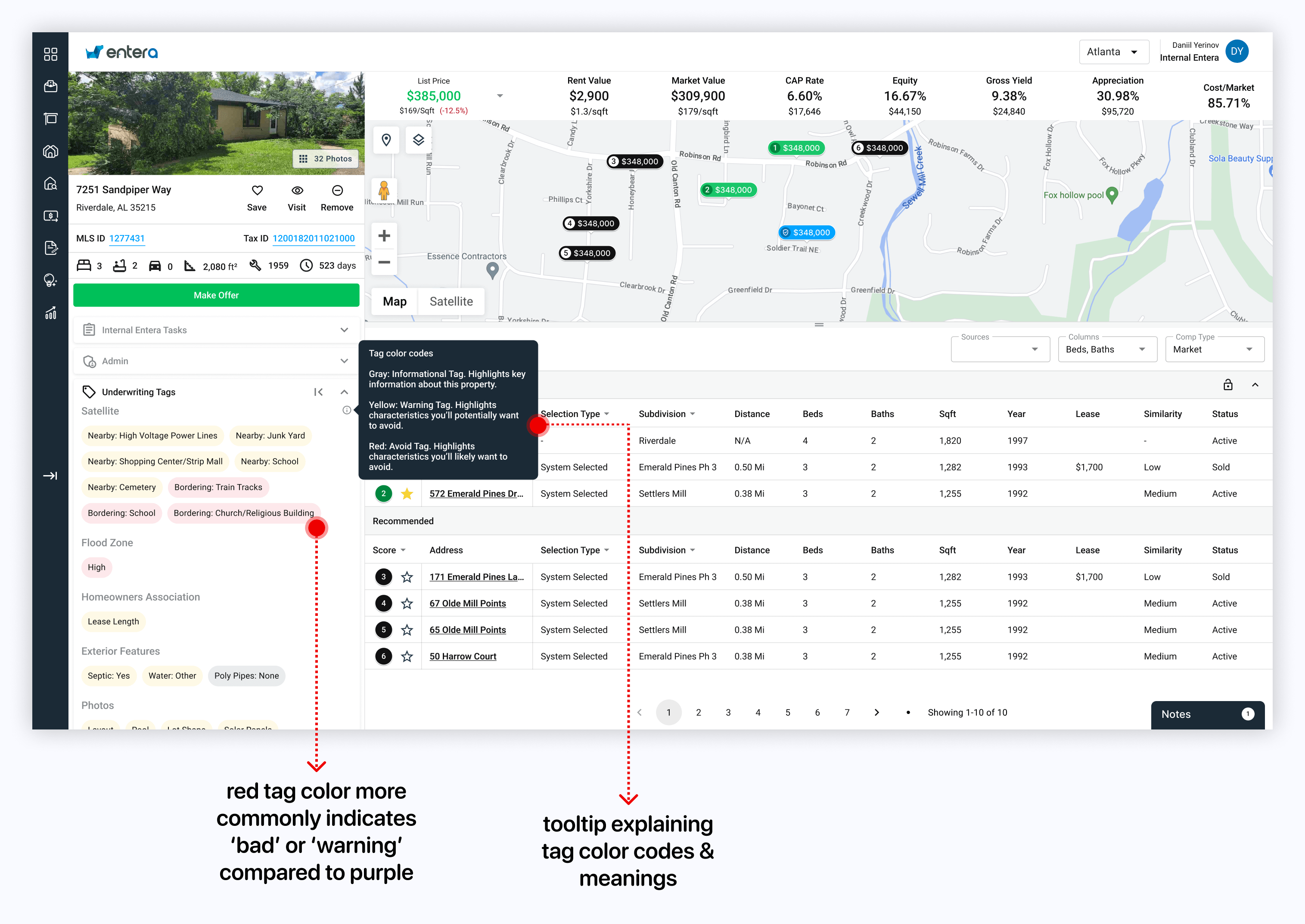
- Clients: The project delivered a summary of key details in the form of tags, which were much quicker to review than free text notes (especially with the help of the color coded tags). This meant clients could take the necessary actions on homes faster than before, increasing their overall activity and transaction volume on the platform
Client View with Feedback Implemented

Single Family Real Estate Investment Platform For Investors
Entera is a 3-sided marketplace focused on connecting Enterprise and Mid-Market investors, sellers and services providers in the single-family residential market. Powered by modern data science and Artificial Intelligence (AI), Entera’s marketplace offers the most seamless solution for investors to access, evaluate, transact and operate their single-family real estate investments.
As a UX/UI designer at Entera, I worked closely with the director of engineering, design teammates, product managers, and senior developers on projects to increase users’ speed and effectiveness in discovering and analyzing residential real estate for purchase at scale.
